
SafePlate Technologies
Role
Project Manager
UX Researcher
UX Designer
Team
2 Project Managers
4 Designers
Timeline
Winter 2025
Tools
FigJam
Figma

Overview
What is SafePlate Technologies?
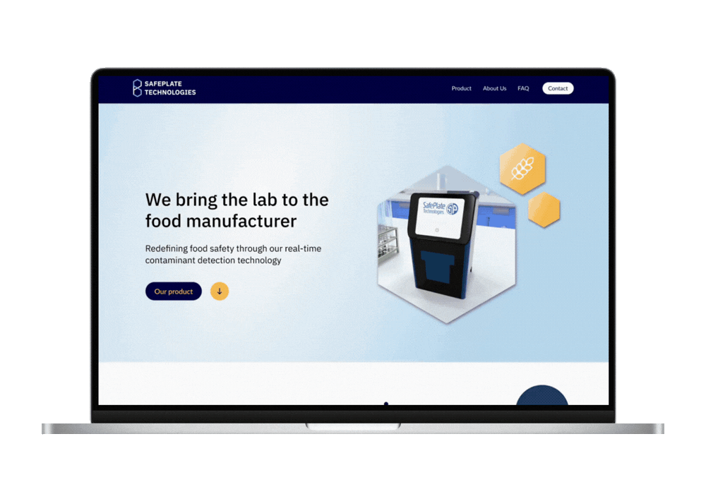
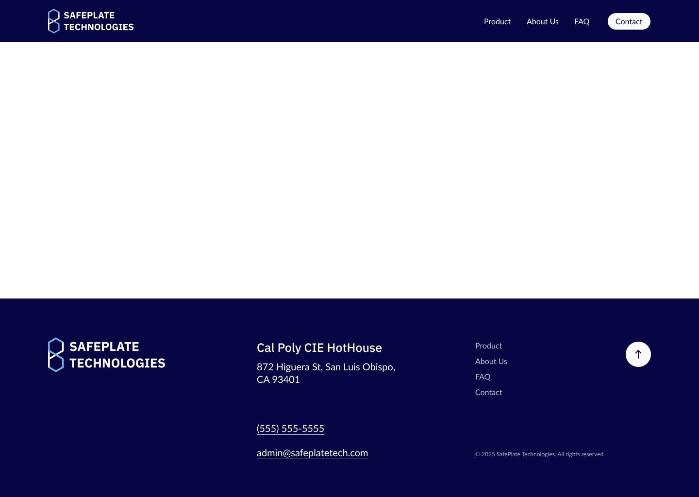
SafePlate Technologies is a start up company established at the California Polytechnic State University by a team of people with different backgrounds in chemistry, food science, mechanical and electrical engineering and business. Their common interests in food safety motivated them to come up with a diagnostic instrument in the effort to anticipate the best to guarantee that food products are of the best quality and safety. Their device provides the first real time, quantitative detection of allergens to enable food manufacturers to understand the specific proportion of allergens in their products, taking the lab to the production floor.
For this project, our point of contact was Avery Taylor, the CTO of SafePlate.
The Problem
As a result, the website did not effectively support SafePlate’s goal of presenting itself as a credible, innovative solution.

💼
Lacked credibility + professionalism

Outdated visuals, inconsistent branding, and an overly bright palette weakened trust and credibility.
🔍
Unclear navigation and limited content
Outdated visuals, inconsistent branding, and an overly bright palette weakened trust and credibility.
📣
Ineffective communication of value
Outdated visuals, inconsistent branding, and an overly bright palette weakened trust and credibility.
Deliverables
Our deliverables consisted of the following:
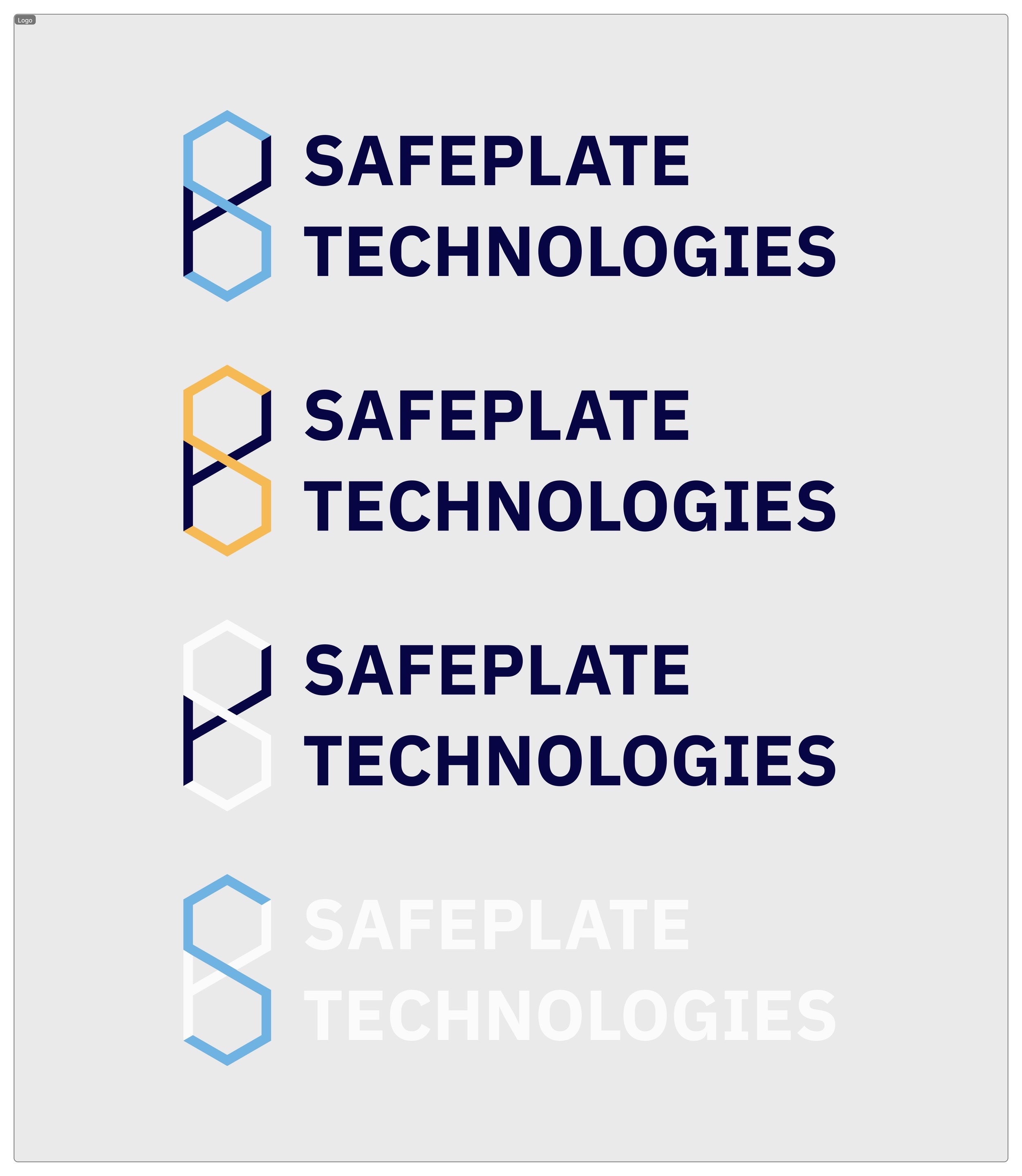
A new design system/branding guide which included a logo, color scheme, and font choices in order to develop a unified identity
The web site will be designed to look like a multi-page format, with clear navigation, interesting visuals and organized content which suits the targeted and major audiences (industry professionals)
Research
We began our research with a team discussion to identify initial observations about the site’s design, branding, and visual tone, which informed the focus of our user interviews. We then conducted impartial, non-leading interviews to gather honest feedback on usability, clarity, and overall impression, intentionally speaking with participants outside the UX/UI field to capture diverse perspectives. These interviews highlighted the following key findings:
We also conducted an interview with a student of Food Science to understand the vision of those working in the industry about the data presentation and homepage priorities. He later referred us to a professor for further professional input, though we unfortunately did not receive a response.
Our insight can be noted below:
Moodboard
Each team member designed a moodboard with possible colors, fonts, layout and other features of the web site like drop downs and icons to identify the correct tone of the new appearance of SafePlate. This helped us in imagining how other design orientations would be able to convey the innovation and professionalism of the brand in a more positive manner.
Next, we took our ideas and synthesized them into a master moodboard with the strongest shared elements. We gave it to our clients, who left their feedback on it by indicating the colors, typography, and visuals that they liked. With their contributions, we managed to get on a unified visual path that could be described as both creative and representative of the brand and team of the company that is SafePlate.


My Area of Focus
I had the role of designing the navigation bar and footer, which would maintain a uniformity and user-friendliness throughout the site. My main focus was on the Product page, and I created the section “Why Use Arceo” and “Our Testing Solutions”.
These parts were meant to communicate the value and functionality of the product in a clear and visual way and balance and hierarchy. I also tested every button to ensure that I could go smoothly to the relevant page, which was used to generate a user-friendly navigation within the site.
The next section showcases my early design iterations through to the final solution, including the contributions from the rest of the team.
Our insight can be noted below:

failed to find a clear
call-to-action
felt overwhelmed by dense text and weak hierarchy, making key information hard to find
of users described the website as outdated, barebones, and unprofessional, reducing credibility

Food Science • 5th Year
Benjamin Lee
Industry Context
Testing occurs post-sanitization to detect allergens and microbes
Production runs scheduled from least to most allergenic
Swab tests use color-change protein indicators
Investor
Priorities
Exact wait times and processing durations
Accuracy and effectiveness metrics
Food-grade confirmation and ease of use
Recommendations
Replace vague claims with time-based metrics
Add competitor comparison (SP vs. market)
Highlight accuracy stats and streamline copy
Design System
Design
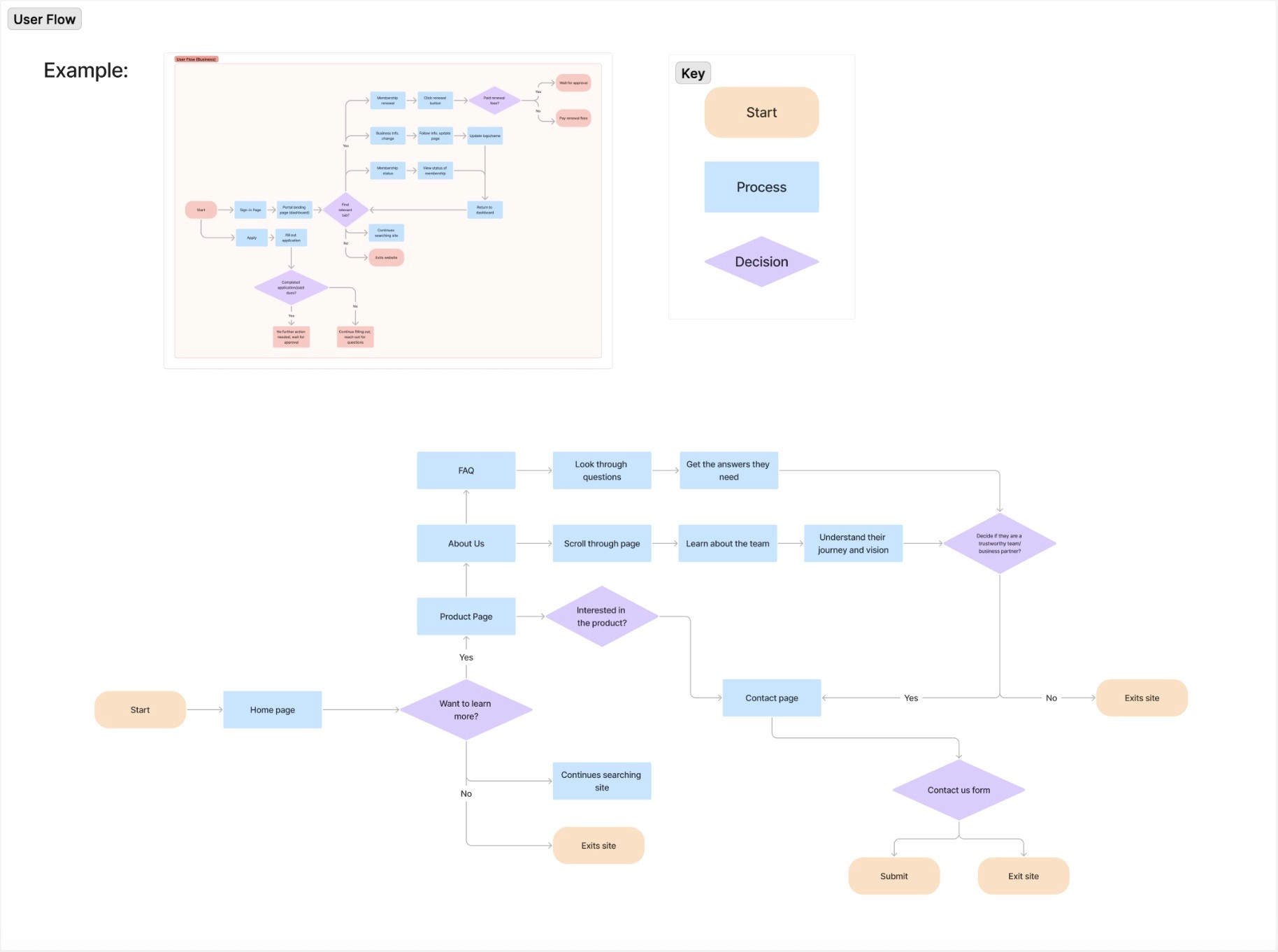
To identify the exact pages required on the site and know what would appear in each page, we developed a content map. This involved the inclusion of the notes of our client, Ben’s suggestions and also our team opinion thus enabling us to set out the information in a very clear manner and also what most users needed to be the priority.
Based on the content map, we created a user flow which depicted how the visitors would browse in every page and section. This enabled us to map out the general travel and make the experience of all users to be comfortable and user-friendly.
User testing showed a strong preference for the redesigned website. Participants found it easier to navigate, more informative, and significantly more credible than the original one-page site. The improved structure, clearer product explanations, and refined visual design helped users better understand the product and feel more confident engaging with the company.

Storyboarding + Wireframes
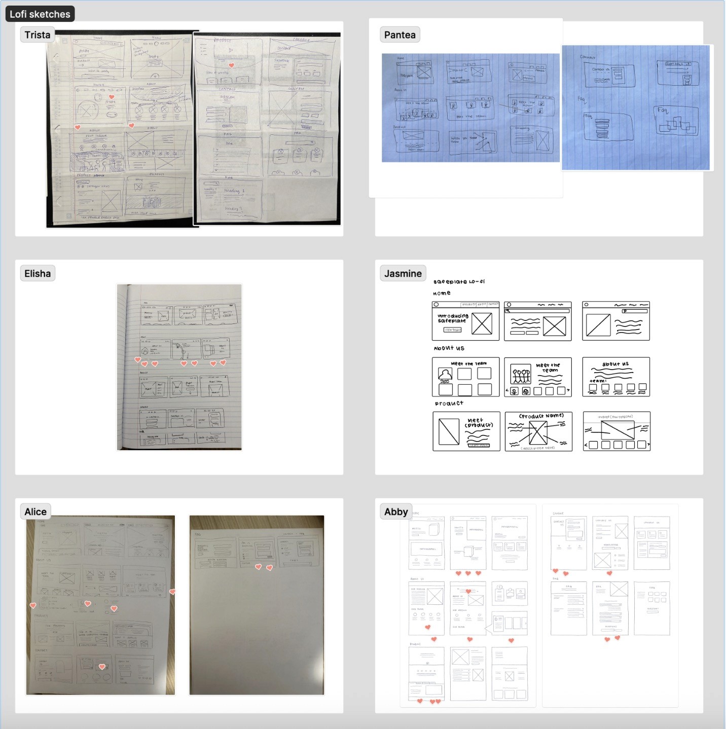
The team then performed Crazy 8s to sketch as fast as possible on various ideas per page. We all shared our best ideas to produce draft wireframes, where we discussed the layout, positioning of content, and structure of the screen in the entire site, which gave a good platform on which the visual design stage would be implemented.
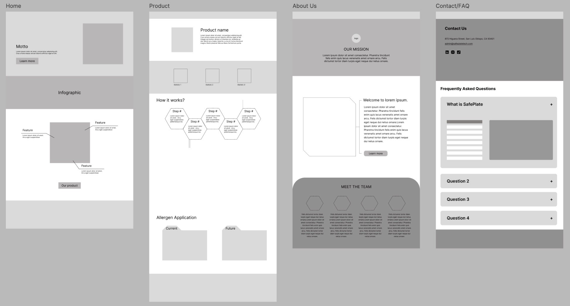
Lo-fi Screens
Mid-fi Screens
Mid-fi A/B Testing

Clarity of purpose
❌ Before
Users struggled to understand the product and its value
✔️ After
Visual explanations and structured content clearly communicate purpose
Credibility & Trust
❌ Before
Sparse content raised skepticism about legitimacy
✔️ After
Team profiles and detailed product info increased trust
Visual Design
❌ Before
Dated serif fonts and dense text reduced readability
✔️ After
Clean typography, visuals, and hierarchy improved scannability
Navigation & Structure
❌ Before
One-page layout confused users
✔️ After
Multi-page navigation matched user expectations
Content Map + Userflow
Solution
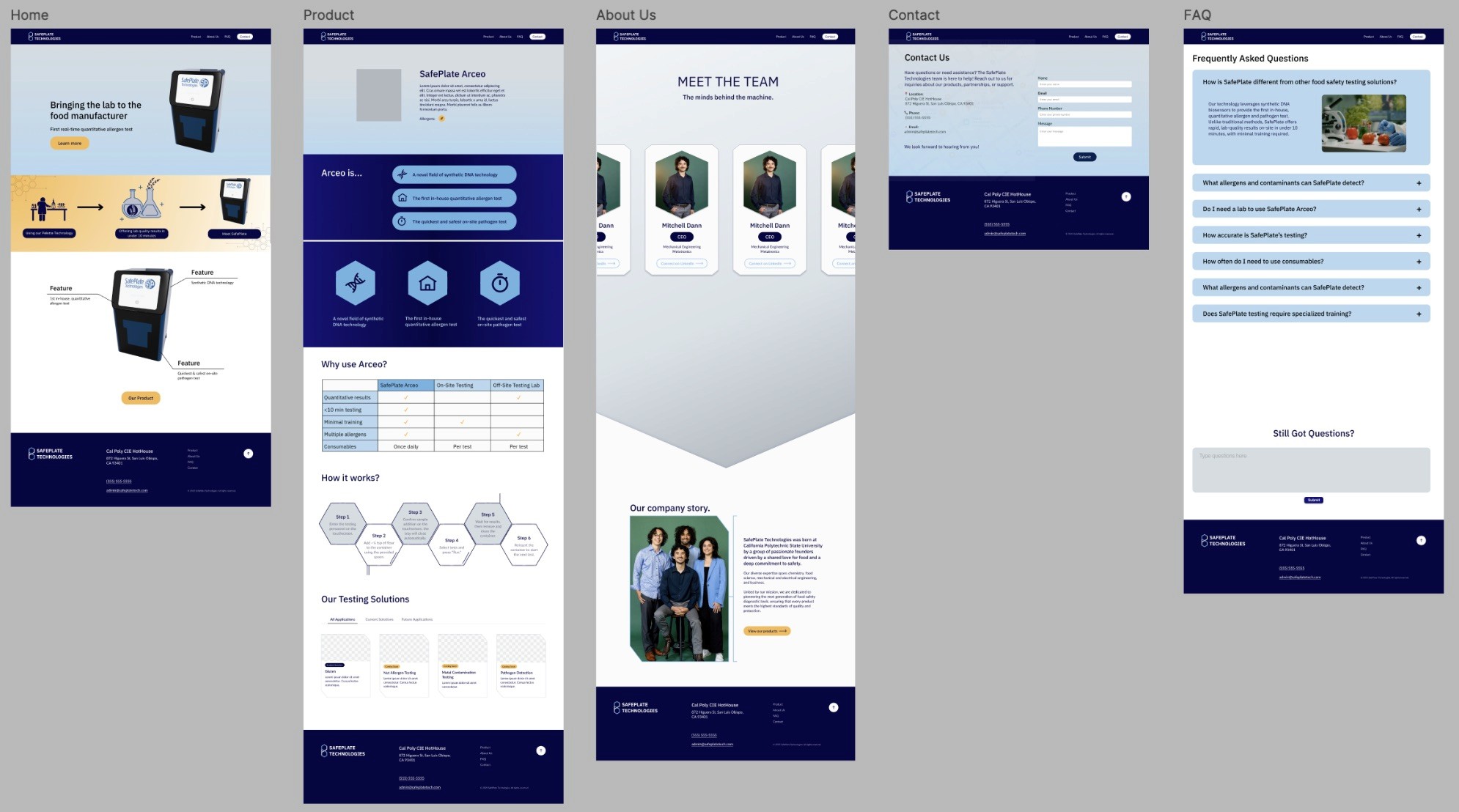
Our redesigned version of SafePlate’s website offers an extensive and professional online presence that would effectively convey the mission, product characteristics, and professionalism of the company. With the multi-page structure created by format, content organization, interactive features, and modern visuals, we enhanced the navigation, readability, and interaction. The site is also representative of the brand identity of SafePlate and at the same time provides an user-friendly experience to both prospective customers and industry professionals.
The redesign, besides making the company more credible and trustworthy, it gave the user a better idea of the product and therefore allowed them to make more informed decisions, and it inspired more confidence in the innovative technology of SafePlate.
Final Prototype
Takeaways
In-depth industry Research
Because SafePlate’s industry was outside our scope, we conducted competitor analysis and user interviews to better understand industry expectations, informing a more credible, functional, and user-centered redesign.
Importance of Branding
This redesign showed how clear structure and refined visuals can strengthen trust and better communicate SafePlate’s mission, product value, and credibility.
Reflection
SafePlate Technologies
Role
Project Manager
UX Researcher
UX Designer
Team
2 Project Managers
4 Designers
Timeline
Winter 2025
Tools
FigJam
Figma
Overview
What is SafePlate Technologies?
SafePlate Technologies is a start up company established at the California Polytechnic State University by a team of people with different backgrounds in chemistry, food science, mechanical and electrical engineering and business. Their common interests in food safety motivated them to come up with a diagnostic instrument in the effort to anticipate the best to guarantee that food products are of the best quality and safety. Their device provides the first real time, quantitative detection of allergens to enable food manufacturers to understand the specific proportion of allergens in their products, taking the lab to the production floor.
For this project, our point of contact was Avery Taylor, the CTO of SafePlate.
The Problem
As a result, the website did not effectively support SafePlate’s goal of presenting itself as a credible, innovative solution.
💼
Lacked credibility + professionalism
Outdated visuals, inconsistent branding, and an overly bright palette weakened trust and credibility.
🔍
Unclear navigation and limited content
Outdated visuals, inconsistent branding, and an overly bright palette weakened trust and credibility.
📣
Ineffective communication of value
Outdated visuals, inconsistent branding, and an overly bright palette weakened trust and credibility.
Deliverables
Our deliverables consisted of the following:
A new design system/branding guide which included a logo, color scheme, and font choices in order to develop a unified identity
The web site will be designed to look like a multi-page format, with clear navigation, interesting visuals and organized content which suits the targeted and major audiences (industry professionals)
Research
We began our research with a team discussion to identify initial observations about the site’s design, branding, and visual tone, which informed the focus of our user interviews. We then conducted impartial, non-leading interviews to gather honest feedback on usability, clarity, and overall impression, intentionally speaking with participants outside the UX/UI field to capture diverse perspectives. These interviews highlighted the following key findings:
We also conducted an interview with a student of Food Science to understand the vision of those working in the industry about the data presentation and homepage priorities. He later referred us to a professor for further professional input, though we unfortunately did not receive a response.
Our insight can be noted below:
Moodboard
Each team member designed a moodboard with possible colors, fonts, layout and other features of the web site like drop downs and icons to identify the correct tone of the new appearance of SafePlate. This helped us in imagining how other design orientations would be able to convey the innovation and professionalism of the brand in a more positive manner.
Next, we took our ideas and synthesized them into a master moodboard with the strongest shared elements. We gave it to our clients, who left their feedback on it by indicating the colors, typography, and visuals that they liked. With their contributions, we managed to get on a unified visual path that could be described as both creative and representative of the brand and team of the company that is SafePlate.
My Area of Focus
I had the role of designing the navigation bar and footer, which would maintain a uniformity and user-friendliness throughout the site. My main focus was on the Product page, and I created the section “Why Use Arceo” and “Our Testing Solutions”.
These parts were meant to communicate the value and functionality of the product in a clear and visual way and balance and hierarchy. I also tested every button to ensure that I could go smoothly to the relevant page, which was used to generate a user-friendly navigation within the site.
The next section showcases my early design iterations through to the final solution, including the contributions from the rest of the team.
Our insight can be noted below:
failed to find a clear
call-to-action
felt overwhelmed by dense text and weak hierarchy, making key information hard to find
of users described the website as outdated, barebones, and unprofessional, reducing credibility
Food Science • 5th Year
Benjamin Lee
Industry Context
Testing occurs post-sanitization to detect allergens and microbes
Production runs scheduled from least to most allergenic
Swab tests use color-change protein indicators
Investor
Priorities
Exact wait times and processing durations
Accuracy and effectiveness metrics
Food-grade confirmation and ease of use
Recommendations
Replace vague claims with time-based metrics
Add competitor comparison (SP vs. market)
Highlight accuracy stats and streamline copy
Design System
Design
Content Map + Userflow
To identify the exact pages required on the site and know what would appear in each page, we developed a content map. This involved the inclusion of the notes of our client, Ben’s suggestions and also our team opinion thus enabling us to set out the information in a very clear manner and also what most users needed to be the priority.
Based on the content map, we created a user flow which depicted how the visitors would browse in every page and section. This enabled us to map out the general travel and make the experience of all users to be comfortable and user-friendly.
User testing showed a strong preference for the redesigned website. Participants found it easier to navigate, more informative, and significantly more credible than the original one-page site. The improved structure, clearer product explanations, and refined visual design helped users better understand the product and feel more confident engaging with the company.
Storyboarding + Wireframes
The team then performed Crazy 8s to sketch as fast as possible on various ideas per page. We all shared our best ideas to produce draft wireframes, where we discussed the layout, positioning of content, and structure of the screen in the entire site, which gave a good platform on which the visual design stage would be implemented.
Lo-fi Screens
Mid-fi Screens
Mid-fi A/B Testing
Clarity of purpose
❌ Before
Users struggled to understand the product and its value
✔️ After
Visual explanations and structured content clearly communicate purpose
Credibility & Trust
❌ Before
Sparse content raised skepticism about legitimacy
✔️ After
Team profiles and detailed product info increased trust
Visual Design
❌ Before
Dated serif fonts and dense text reduced readability
✔️ After
Clean typography, visuals, and hierarchy improved scannability
Navigation & Structure
❌ Before
One-page layout confused users
✔️ After
Multi-page navigation matched user expectations
Solution
Our redesigned version of SafePlate’s website offers an extensive and professional online presence that would effectively convey the mission, product characteristics, and professionalism of the company. With the multi-page structure created by format, content organization, interactive features, and modern visuals, we enhanced the navigation, readability, and interaction. The site is also representative of the brand identity of SafePlate and at the same time provides an user-friendly experience to both prospective customers and industry professionals.
The redesign, besides making the company more credible and trustworthy, it gave the user a better idea of the product and therefore allowed them to make more informed decisions, and it inspired more confidence in the innovative technology of SafePlate.
Final Prototype
Takeaways
In-depth industry Research
Because SafePlate’s industry was outside our scope, we conducted competitor analysis and user interviews to better understand industry expectations, informing a more credible, functional, and user-centered redesign.
Importance of Branding
This redesign showed how clear structure and refined visuals can strengthen trust and better communicate SafePlate’s mission, product value, and credibility.
Reflection
SafePlate Technologies
Role
Project Manager
UX Researcher
UX Designer
Team
2 Project Managers
4 Designers
Timeline
Winter 2025
Tools
FigJam
Figma
Overview
What is SafePlate Technologies?
SafePlate Technologies is a start up company established at the California Polytechnic State University by a team of people with different backgrounds in chemistry, food science, mechanical and electrical engineering and business. Their common interests in food safety motivated them to come up with a diagnostic instrument in the effort to anticipate the best to guarantee that food products are of the best quality and safety. Their device provides the first real time, quantitative detection of allergens to enable food manufacturers to understand the specific proportion of allergens in their products, taking the lab to the production floor.
For this project, our point of contact was Avery Taylor, the CTO of SafePlate.
The Problem
As a result, the website did not effectively support SafePlate’s goal of presenting itself as a credible, innovative solution.
💼
Lacked credibility + professionalism
Outdated visuals, inconsistent branding, and an overly bright palette weakened trust and credibility.
🔍
Unclear navigation and limited content
Outdated visuals, inconsistent branding, and an overly bright palette weakened trust and credibility.
📣
Ineffective communication of value
Outdated visuals, inconsistent branding, and an overly bright palette weakened trust and credibility.
Deliverables
Our deliverables consisted of the following:
A new design system/branding guide which included a logo, color scheme, and font choices in order to develop a unified identity
The web site will be designed to look like a multi-page format, with clear navigation, interesting visuals and organized content which suits the targeted and major audiences (industry professionals)
Research
We began our research with a team discussion to identify initial observations about the site’s design, branding, and visual tone, which informed the focus of our user interviews. We then conducted impartial, non-leading interviews to gather honest feedback on usability, clarity, and overall impression, intentionally speaking with participants outside the UX/UI field to capture diverse perspectives. These interviews highlighted the following key findings:
We also conducted an interview with a student of Food Science to understand the vision of those working in the industry about the data presentation and homepage priorities. He later referred us to a professor for further professional input, though we unfortunately did not receive a response.
Our insight can be noted below:
Moodboard
Each team member designed a moodboard with possible colors, fonts, layout and other features of the web site like drop downs and icons to identify the correct tone of the new appearance of SafePlate. This helped us in imagining how other design orientations would be able to convey the innovation and professionalism of the brand in a more positive manner.
Next, we took our ideas and synthesized them into a master moodboard with the strongest shared elements. We gave it to our clients, who left their feedback on it by indicating the colors, typography, and visuals that they liked. With their contributions, we managed to get on a unified visual path that could be described as both creative and representative of the brand and team of the company that is SafePlate.
My Area of Focus
I had the role of designing the navigation bar and footer, which would maintain a uniformity and user-friendliness throughout the site. My main focus was on the Product page, and I created the section “Why Use Arceo” and “Our Testing Solutions”.
These parts were meant to communicate the value and functionality of the product in a clear and visual way and balance and hierarchy. I also tested every button to ensure that I could go smoothly to the relevant page, which was used to generate a user-friendly navigation within the site.
The next section showcases my early design iterations through to the final solution, including the contributions from the rest of the team.
Our insight can be noted below:
failed to find a clear
call-to-action
felt overwhelmed by dense text and weak hierarchy, making key information hard to find
of users described the website as outdated, barebones, and unprofessional, reducing credibility
Food Science • 5th Year
Benjamin Lee
Industry Context
Testing occurs post-sanitization to detect allergens and microbes
Production runs scheduled from least to most allergenic
Swab tests use color-change protein indicators
Investor
Priorities
Exact wait times and processing durations
Accuracy and effectiveness metrics
Food-grade confirmation and ease of use
Recommendations
Replace vague claims with time-based metrics
Add competitor comparison (SP vs. market)
Highlight accuracy stats and streamline copy
Design System
Design
To identify the exact pages required on the site and know what would appear in each page, we developed a content map. This involved the inclusion of the notes of our client, Ben’s suggestions and also our team opinion thus enabling us to set out the information in a very clear manner and also what most users needed to be the priority.
Based on the content map, we created a user flow which depicted how the visitors would browse in every page and section. This enabled us to map out the general travel and make the experience of all users to be comfortable and user-friendly.
User testing showed a strong preference for the redesigned website. Participants found it easier to navigate, more informative, and significantly more credible than the original one-page site. The improved structure, clearer product explanations, and refined visual design helped users better understand the product and feel more confident engaging with the company.
Storyboarding + Wireframes
The team then performed Crazy 8s to sketch as fast as possible on various ideas per page. We all shared our best ideas to produce draft wireframes, where we discussed the layout, positioning of content, and structure of the screen in the entire site, which gave a good platform on which the visual design stage would be implemented.
Lo-fi Screens
Mid-fi Screens
Mid-fi A/B Testing
Clarity of purpose
❌ Before
Users struggled to understand the product and its value
✔️ After
Visual explanations and structured content clearly communicate purpose
Credibility & Trust
❌ Before
Sparse content raised skepticism about legitimacy
✔️ After
Team profiles and detailed product info increased trust
Visual Design
❌ Before
Dated serif fonts and dense text reduced readability
✔️ After
Clean typography, visuals, and hierarchy improved scannability
Navigation & Structure
❌ Before
One-page layout confused users
✔️ After
Multi-page navigation matched user expectations
Clarity of purpose
❌ Before
Users struggled to understand the product and its value
✔️ After
Visual explanations and structured content clearly communicate purpose
Credibility & Trust
❌ Before
Sparse content raised skepticism about legitimacy
✔️ After
Team profiles and detailed product info increased trust
Visual Design
❌ Before
Dated serif fonts and dense text reduced readability
✔️ After
Clean typography, visuals, and hierarchy improved scannability
Navigation & Structure
❌ Before
One-page layout confused users
✔️ After
Multi-page navigation matched user expectations
Clarity of purpose
❌ Before
Users struggled to understand the product and its value
✔️ After
Visual explanations and structured content clearly communicate purpose
Credibility & Trust
❌ Before
Sparse content raised skepticism about legitimacy
✔️ After
Team profiles and detailed product info increased trust
Visual Design
❌ Before
Dated serif fonts and dense text reduced readability
✔️ After
Clean typography, visuals, and hierarchy improved scannability
Navigation & Structure
❌ Before
One-page layout confused users
✔️ After
Multi-page navigation matched user expectations
Clarity of purpose
❌ Before
Users struggled to understand the product and its value
✔️ After
Visual explanations and structured content clearly communicate purpose
Credibility & Trust
❌ Before
Sparse content raised skepticism about legitimacy
✔️ After
Team profiles and detailed product info increased trust
Visual Design
❌ Before
Dated serif fonts and dense text reduced readability
✔️ After
Clean typography, visuals, and hierarchy improved scannability
Navigation & Structure
❌ Before
One-page layout confused users
✔️ After
Multi-page navigation matched user expectations
Content Map + Userflow
Solution
Our redesigned version of SafePlate’s website offers an extensive and professional online presence that would effectively convey the mission, product characteristics, and professionalism of the company. With the multi-page structure created by format, content organization, interactive features, and modern visuals, we enhanced the navigation, readability, and interaction. The site is also representative of the brand identity of SafePlate and at the same time provides an user-friendly experience to both prospective customers and industry professionals.
The redesign, besides making the company more credible and trustworthy, it gave the user a better idea of the product and therefore allowed them to make more informed decisions, and it inspired more confidence in the innovative technology of SafePlate.
Final Prototype
Takeaways
In-depth industry Research
Because SafePlate’s industry was outside our scope, we conducted competitor analysis and user interviews to better understand industry expectations, informing a more credible, functional, and user-centered redesign.
Importance of Branding
This redesign showed how clear structure and refined visuals can strengthen trust and better communicate SafePlate’s mission, product value, and credibility.
Reflection
SafePlate Technologies
Role
Project Manager
UX Researcher
UX Designer
Team
2 Project Managers
4 Designers
Timeline
Winter 2025
Tools
FigJam
Figma
Overview
What is SafePlate Technologies?
SafePlate Technologies is a start up company established at the California Polytechnic State University by a team of people with different backgrounds in chemistry, food science, mechanical and electrical engineering and business. Their common interests in food safety motivated them to come up with a diagnostic instrument in the effort to anticipate the best to guarantee that food products are of the best quality and safety. Their device provides the first real time, quantitative detection of allergens to enable food manufacturers to understand the specific proportion of allergens in their products, taking the lab to the production floor.
For this project, our point of contact was Avery Taylor, the CTO of SafePlate.
The Problem
As a result, the website did not effectively support SafePlate’s goal of presenting itself as a credible, innovative solution.
💼
Lacked credibility + professionalism
Outdated visuals, inconsistent branding, and an overly bright palette weakened trust and credibility.
🔍
Unclear navigation and limited content
Outdated visuals, inconsistent branding, and an overly bright palette weakened trust and credibility.
📣
Ineffective communication of value
Outdated visuals, inconsistent branding, and an overly bright palette weakened trust and credibility.
Deliverables
Our deliverables consisted of the following:
A new design system/branding guide which included a logo, color scheme, and font choices in order to develop a unified identity
The web site will be designed to look like a multi-page format, with clear navigation, interesting visuals and organized content which suits the targeted and major audiences (industry professionals)
Research
We began our research with a team discussion to identify initial observations about the site’s design, branding, and visual tone, which informed the focus of our user interviews. We then conducted impartial, non-leading interviews to gather honest feedback on usability, clarity, and overall impression, intentionally speaking with participants outside the UX/UI field to capture diverse perspectives. These interviews highlighted the following key findings:
We also conducted an interview with a student of Food Science to understand the vision of those working in the industry about the data presentation and homepage priorities. He later referred us to a professor for further professional input, though we unfortunately did not receive a response.
Our insight can be noted below:
Moodboard
Each team member designed a moodboard with possible colors, fonts, layout and other features of the web site like drop downs and icons to identify the correct tone of the new appearance of SafePlate. This helped us in imagining how other design orientations would be able to convey the innovation and professionalism of the brand in a more positive manner.
Next, we took our ideas and synthesized them into a master moodboard with the strongest shared elements. We gave it to our clients, who left their feedback on it by indicating the colors, typography, and visuals that they liked. With their contributions, we managed to get on a unified visual path that could be described as both creative and representative of the brand and team of the company that is SafePlate.
My Area of Focus
I had the role of designing the navigation bar and footer, which would maintain a uniformity and user-friendliness throughout the site. My main focus was on the Product page, and I created the section “Why Use Arceo” and “Our Testing Solutions”.
These parts were meant to communicate the value and functionality of the product in a clear and visual way and balance and hierarchy. I also tested every button to ensure that I could go smoothly to the relevant page, which was used to generate a user-friendly navigation within the site.
The next section showcases my early design iterations through to the final solution, including the contributions from the rest of the team.
Our insight can be noted below:
failed to find a clear
call-to-action
felt overwhelmed by dense text and weak hierarchy, making key information hard to find
of users described the website as outdated, barebones, and unprofessional, reducing credibility
Food Science • 5th Year
Benjamin Lee
Industry Context
Testing occurs post-sanitization to detect allergens and microbes
Production runs scheduled from least to most allergenic
Swab tests use color-change protein indicators
Investor
Priorities
Exact wait times and processing durations
Accuracy and effectiveness metrics
Food-grade confirmation and ease of use
Recommendations
Replace vague claims with time-based metrics
Add competitor comparison (SP vs. market)
Highlight accuracy stats and streamline copy
Design System
Design
Content Map + Userflow
To identify the exact pages required on the site and know what would appear in each page, we developed a content map. This involved the inclusion of the notes of our client, Ben’s suggestions and also our team opinion thus enabling us to set out the information in a very clear manner and also what most users needed to be the priority.
Based on the content map, we created a user flow which depicted how the visitors would browse in every page and section. This enabled us to map out the general travel and make the experience of all users to be comfortable and user-friendly.
User testing showed a strong preference for the redesigned website. Participants found it easier to navigate, more informative, and significantly more credible than the original one-page site. The improved structure, clearer product explanations, and refined visual design helped users better understand the product and feel more confident engaging with the company.
Storyboarding + Wireframes
The team then performed Crazy 8s to sketch as fast as possible on various ideas per page. We all shared our best ideas to produce draft wireframes, where we discussed the layout, positioning of content, and structure of the screen in the entire site, which gave a good platform on which the visual design stage would be implemented.
Lo-fi Screens
Mid-fi Screens
Mid-fi A/B Testing
Clarity of purpose
❌ Before
Users struggled to understand the product and its value
✔️ After
Visual explanations and structured content clearly communicate purpose
Credibility & Trust
❌ Before
Sparse content raised skepticism about legitimacy
✔️ After
Team profiles and detailed product info increased trust
Visual Design
❌ Before
Dated serif fonts and dense text reduced readability
✔️ After
Clean typography, visuals, and hierarchy improved scannability
Navigation & Structure
❌ Before
One-page layout confused users
✔️ After
Multi-page navigation matched user expectations
Clarity of purpose
❌ Before
Users struggled to understand the product and its value
✔️ After
Visual explanations and structured content clearly communicate purpose
Credibility & Trust
❌ Before
Sparse content raised skepticism about legitimacy
✔️ After
Team profiles and detailed product info increased trust
Visual Design
❌ Before
Dated serif fonts and dense text reduced readability
✔️ After
Clean typography, visuals, and hierarchy improved scannability
Navigation & Structure
❌ Before
One-page layout confused users
✔️ After
Multi-page navigation matched user expectations
Clarity of purpose
❌ Before
Users struggled to understand the product and its value
✔️ After
Visual explanations and structured content clearly communicate purpose
Credibility & Trust
❌ Before
Sparse content raised skepticism about legitimacy
✔️ After
Team profiles and detailed product info increased trust
Visual Design
❌ Before
Dated serif fonts and dense text reduced readability
✔️ After
Clean typography, visuals, and hierarchy improved scannability
Navigation & Structure
❌ Before
One-page layout confused users
✔️ After
Multi-page navigation matched user expectations
Clarity of purpose
❌ Before
Users struggled to understand the product and its value
✔️ After
Visual explanations and structured content clearly communicate purpose
Credibility & Trust
❌ Before
Sparse content raised skepticism about legitimacy
✔️ After
Team profiles and detailed product info increased trust
Visual Design
❌ Before
Dated serif fonts and dense text reduced readability
✔️ After
Clean typography, visuals, and hierarchy improved scannability
Navigation & Structure
❌ Before
One-page layout confused users
✔️ After
Multi-page navigation matched user expectations
Solution
Our redesigned version of SafePlate’s website offers an extensive and professional online presence that would effectively convey the mission, product characteristics, and professionalism of the company. With the multi-page structure created by format, content organization, interactive features, and modern visuals, we enhanced the navigation, readability, and interaction. The site is also representative of the brand identity of SafePlate and at the same time provides an user-friendly experience to both prospective customers and industry professionals.
The redesign, besides making the company more credible and trustworthy, it gave the user a better idea of the product and therefore allowed them to make more informed decisions, and it inspired more confidence in the innovative technology of SafePlate.
Final Prototype
Takeaways
In-depth industry Research
Because SafePlate’s industry was outside our scope, we conducted competitor analysis and user interviews to better understand industry expectations, informing a more credible, functional, and user-centered redesign.
Importance of Branding
This redesign showed how clear structure and refined visuals can strengthen trust and better communicate SafePlate’s mission, product value, and credibility.
Reflection
SafePlate Technologies
Role
Project Manager
UX Researcher
UX Designer
Team
2 Proj. Managers
4 Designers
Timeline
Winter 2025
Tools
FigJam
Figma
The Problem
As a result, the website did not effectively support SafePlate’s goal of presenting itself as a credible, innovative solution.
Overview
Overview
What is SafePlate Technologies?
SafePlate Technologies is a start up company established at the California Polytechnic State University by a team of people with different backgrounds in chemistry, food science, mechanical and electrical engineering and business. Their common interests in food safety motivated them to come up with a diagnostic instrument in the effort to anticipate the best to guarantee that food products are of the best quality and safety. Their device provides the first real time, quantitative detection of allergens to enable food manufacturers to understand the specific proportion of allergens in their products, taking the lab to the production floor.
For this project, our point of contact was Avery Taylor, the CTO of SafePlate.
💼
Lacked credibility + professionalism
Outdated visuals, inconsistent branding, and an overly bright palette weakened trust and credibility.
🔍
Unclear navigation and limited content
Outdated visuals, inconsistent branding, and an overly bright palette weakened trust and credibility.
📣
Ineffective communication of value
Outdated visuals, inconsistent branding, and an overly bright palette weakened trust and credibility.
Deliverables
Deliverables
Our deliverables consisted of the following:
A new design system/branding guide which included a logo, color scheme, and font choices in order to develop a unified identity
The web site will be designed to look like a multi-page format, with clear navigation, interesting visuals and organized content which suits the targeted and major audiences (industry professionals)
Research
Research
We began our research with a team discussion to identify initial observations about the site’s design, branding, and visual tone, which informed the focus of our user interviews. We then conducted impartial, non-leading interviews to gather honest feedback on usability, clarity, and overall impression, intentionally speaking with participants outside the UX/UI field to capture diverse perspectives. These interviews highlighted the following key findings:
We also conducted an interview with a student of Food Science to understand the vision of those working in the industry about the data presentation and homepage priorities. He later referred us to a professor for further professional input, though we unfortunately did not receive a response.
Our insight can be noted below:
failed to find a clear
call-to-action
failed to find a clear
call-to-action
felt overwhelmed by dense text and weak hierarchy, making key information hard to find
felt overwhelmed by dense text and weak hierarchy, making key information hard to find
of users described the website as outdated, barebones, and unprofessional, reducing credibility
of users described the website as outdated, barebones, and unprofessional, reducing credibility
Food Science • 5th Year
Benjamin Lee
Food Science • 5th Year
Benjamin Lee
Industry Context
Testing occurs post-sanitization to detect allergens and microbes
Production runs scheduled from least to most allergenic
Swab tests use color-change protein indicators
Investor
Priorities
Exact wait times and processing durations
Accuracy and effectiveness metrics
Food-grade confirmation and ease of use
Recommendations
Replace vague claims with time-based metrics
Add competitor comparison (SP vs. market)
Highlight accuracy stats and streamline copy
Moodboard
Each team member designed a moodboard with possible colors, fonts, layout and other features of the web site like drop downs and icons to identify the correct tone of the new appearance of SafePlate. This helped us in imagining how other design orientations would be able to convey the innovation and professionalism of the brand in a more positive manner.
Next, we took our ideas and synthesized them into a master moodboard with the strongest shared elements. We gave it to our clients, who left their feedback on it by indicating the colors, typography, and visuals that they liked. With their contributions, we managed to get on a unified visual path that could be described as both creative and representative of the brand and team of the company that is SafePlate.
My Area of Focus
I had the role of designing the navigation bar and footer, which would maintain a uniformity and user-friendliness throughout the site. My main focus was on the Product page, and I created the section “Why Use Arceo” and “Our Testing Solutions”.
These parts were meant to communicate the value and functionality of the product in a clear and visual way and balance and hierarchy. I also tested every button to ensure that I could go smoothly to the relevant page, which was used to generate a user-friendly navigation within the site.
User testing showed a strong preference for the redesigned website. Participants found it easier to navigate, more informative, and significantly more credible than the original one-page site. The improved structure, clearer product explanations, and refined visual design helped users better understand the product and feel more confident engaging with the company.
Design
Design
Storyboarding + Wireframes
The team then performed Crazy 8s to sketch as fast as possible on various ideas per page. We all shared our best ideas to produce draft wireframes, where we discussed the layout, positioning of content, and structure of the screen in the entire site, which gave a good platform on which the visual design stage would be implemented.
Design System
Design System
To identify the exact pages required on the site and know what would appear in each page, we developed a content map. This involved the inclusion of the notes of our client, Ben’s suggestions and also our team opinion thus enabling us to set out the information in a very clear manner and also what most users needed to be the priority.
Based on the content map, we created a user flow which depicted how the visitors would browse in every page and section. This enabled us to map out the general travel and make the experience of all users to be comfortable and user-friendly.
Mid-fi A/B Testing
Clarity of purpose
Users struggled to understand the product and its value
❌ Before
Visual explanations and structured content clearly communicate purpose
✔️ After
Credibility & Trust
Sparse content raised skepticism about legitimacy
❌ Before
Team profiles and detailed product info increased trust
✔️ After
Visual Design
Dated serif fonts and dense text reduced readability
❌ Before
Clean typography, visuals, and hierarchy improved scannability
✔️ After
Navigation & Structure
One-page layout confused users
❌ Before
Multi-page navigation matched user expectations
✔️ After
Mid-fi Screens
Lo-fi Screens
Solution
Solution
Our redesigned version of SafePlate’s website offers an extensive and professional online presence that would effectively convey the mission, product characteristics, and professionalism of the company. With the multi-page structure created by format, content organization, interactive features, and modern visuals, we enhanced the navigation, readability, and interaction. The site is also representative of the brand identity of SafePlate and at the same time provides an user-friendly experience to both prospective customers and industry professionals.
The redesign, besides making the company more credible and trustworthy, it gave the user a better idea of the product and therefore allowed them to make more informed decisions, and it inspired more confidence in the innovative technology of SafePlate.
Final Prototype
Reflection
Reflection
Takeaways
In-depth Industry research
Because SafePlate’s industry was outside our scope, we conducted competitor analysis and user interviews to better understand industry expectations, informing a more credible, functional, and user-centered redesign.
In-depth Industry research
Because SafePlate’s industry was outside our scope, we conducted competitor analysis and user interviews to better understand industry expectations, informing a more credible, functional, and user-centered redesign.
Importance of branding
This redesign showed how clear structure and refined visuals can strengthen trust and better communicate SafePlate’s mission, product value, and credibility.
Importance of branding
This redesign showed how clear structure and refined visuals can strengthen trust and better communicate SafePlate’s mission, product value, and credibility.

