


Hispanic Business Association
Role
UX Researcher
UX Designer
Team
4 Designers
8 Developers
Timeline
Fall 2025
Winter 2025
Tools
FigJam
Figma

Overview
What is the Hispanic Business Accociation?
The Hispanic Business Association (HBA) is a non-profit organization whose mission is to support the growth and success of Hispanic-owned businesses on California’s Central Coast. They are built on a foundation of networking, community participation, and cultural awareness, which connects the Spanish-speaking clients with the businesses that align with their values.
Through monthly meetings and local engagement, the organization helps to provide resources, mentorship opportunities, and a platform for business collaboration. Today, HBA has around 30 members who play a significant role in the development of business within the Hispanic community.
For this project, our point of contact was Maria Garcia, the President of HBA, who provided insight into her challenges and goals.
The Problem
This process was tedious, inefficient, and unsustainable as the organization continued to expand, preventing Maria from focusing on more impactful community work.

📝
Manual Membership Intake

Hand-submitted applications caused delays, errors, and added admin workload.
📊
Disconnected Data & Workflows
Managing member data, invoices, and communications across ledgers and QuickBooks created repetitive admin work.
📈
Lack of Membership Insight/Growth
Handling renewals, engagement, and reports manually increased admin burden and made growth hard to track.
Deliverables
Our deliverable was to design a dashboard portal that would address all of Maria’s needs and concerns. Since this would be a newly implemented system, we conducted research on existing portal layouts and how they would efficiently be designed.
Our team divided the tasks: two designers worked on the admin view, while the other two handled the business view.
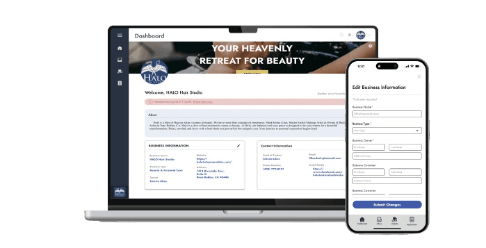
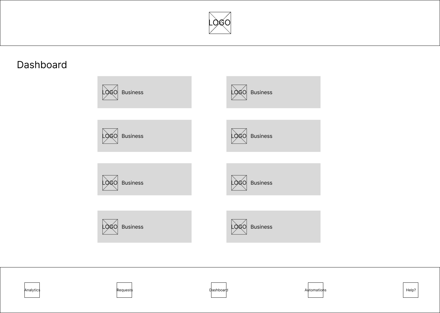
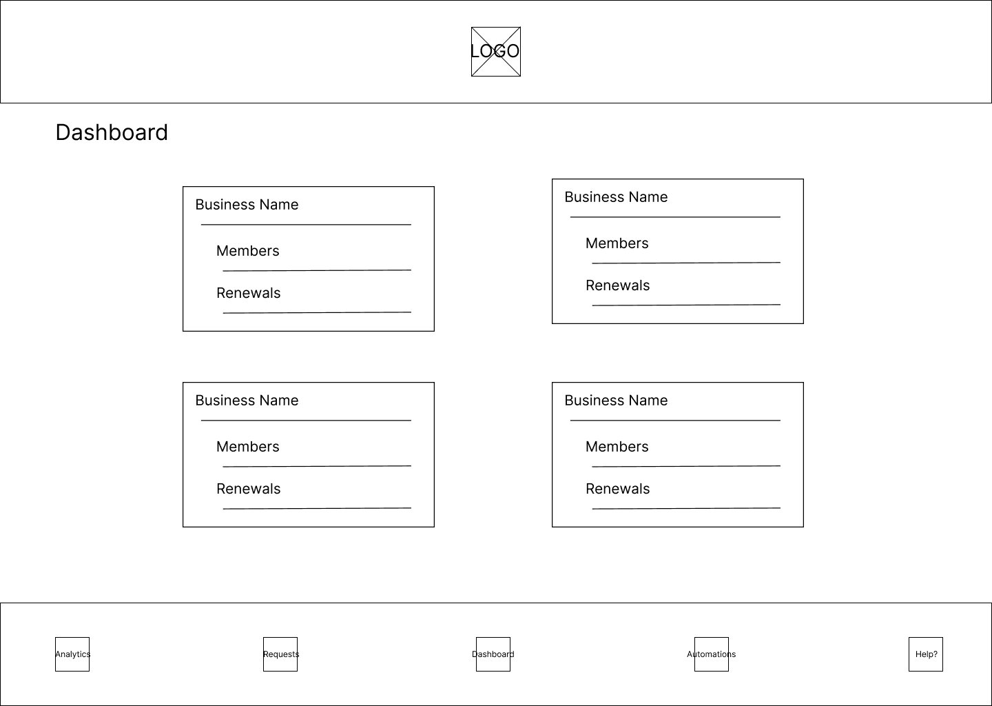
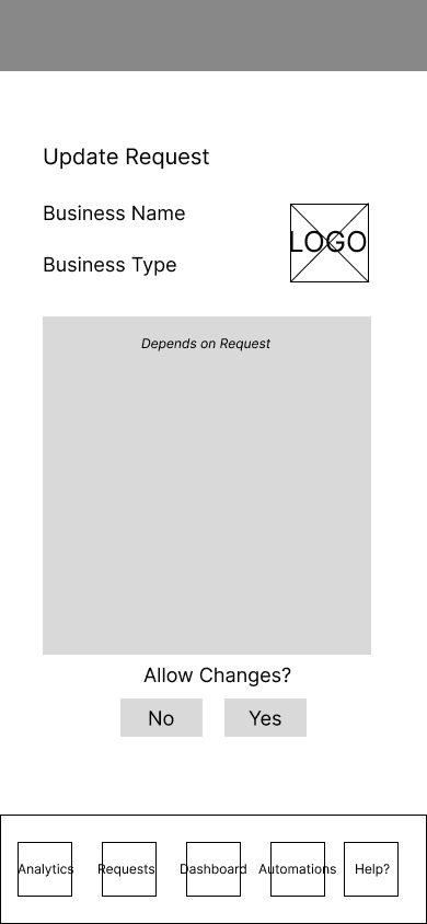
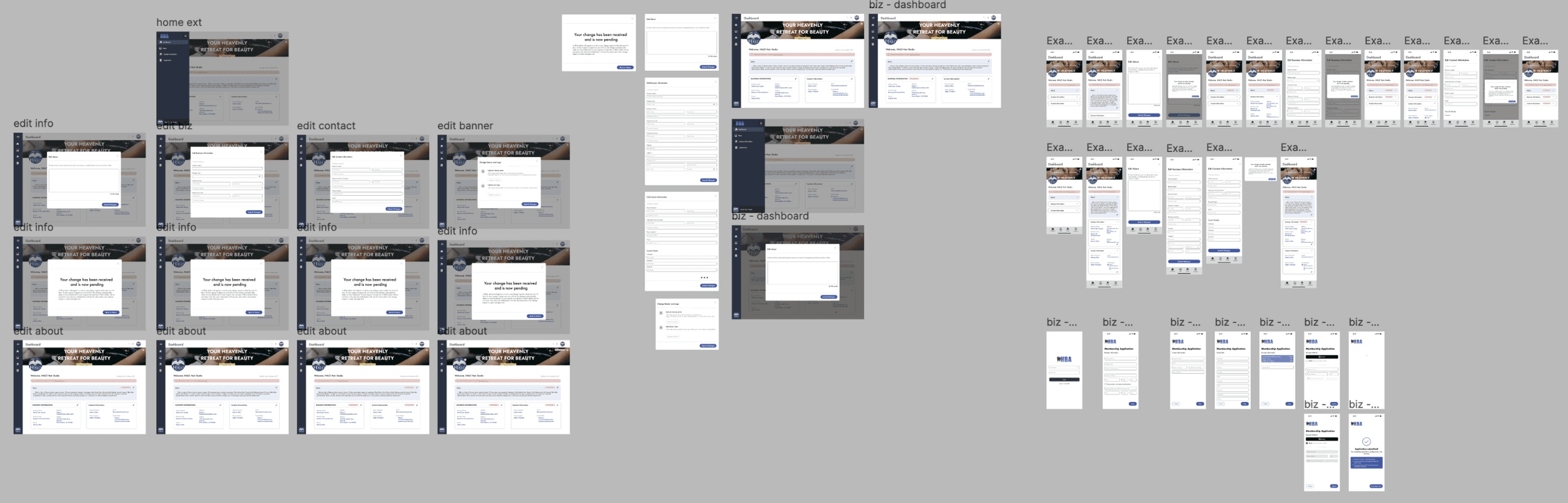
Admin View
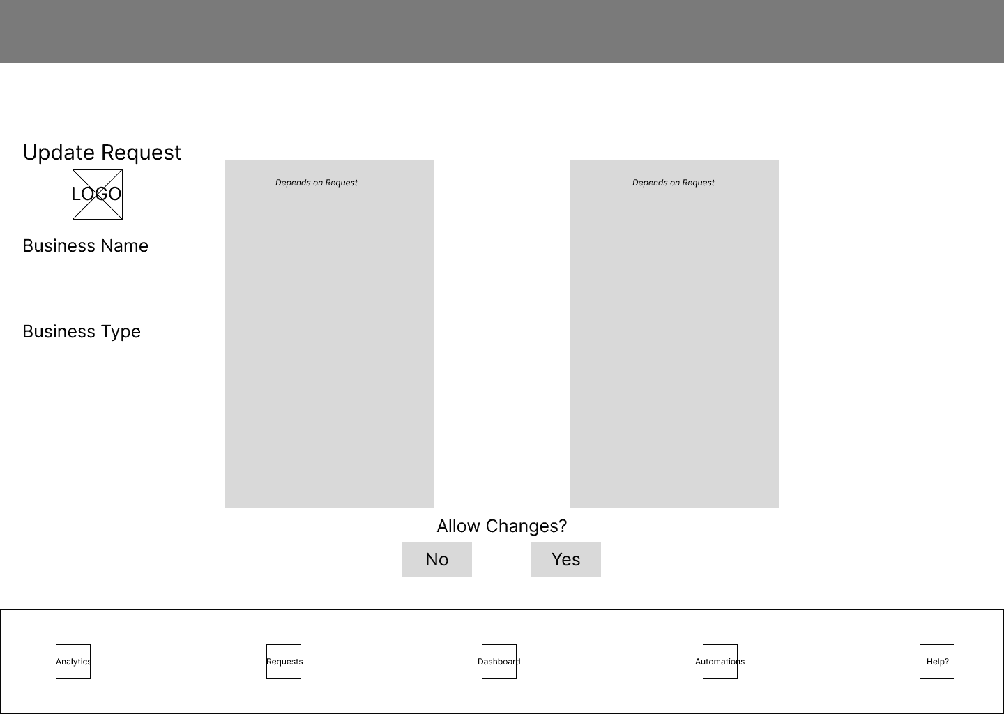
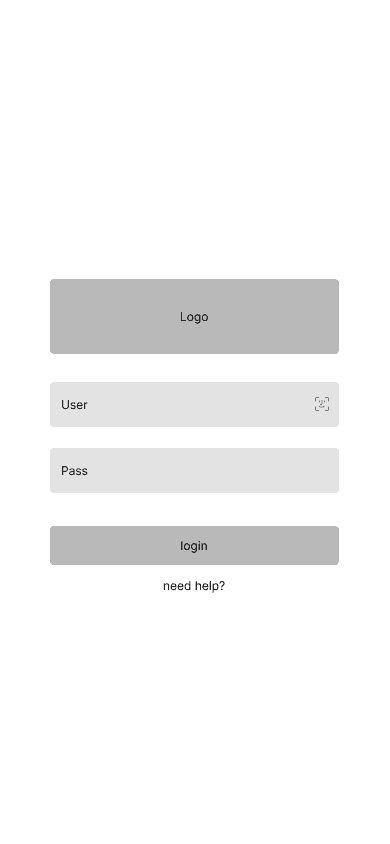
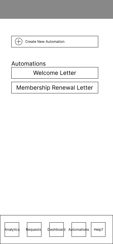
The admin dashboard includes:
a simple login screen
a section for managing business requests
visual data reports of businesses
automated email distribution of welcome letters and notices

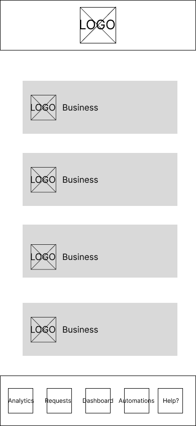
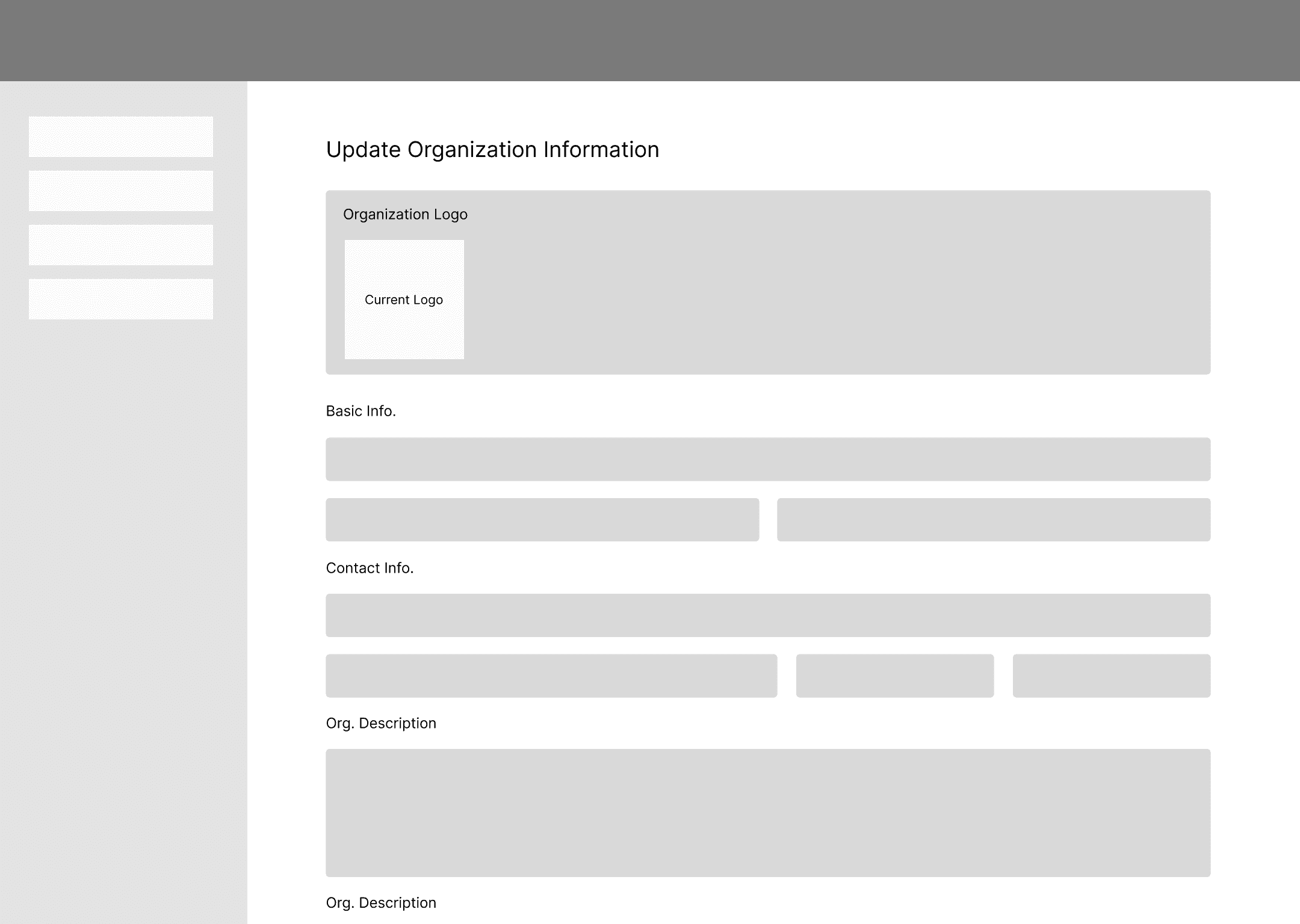
Business View
The bus. dashboard includes:
editing business information like the business owner, point of contact, address, and contact details
a membership sign-up interface which allows new business to request to join the association
Research
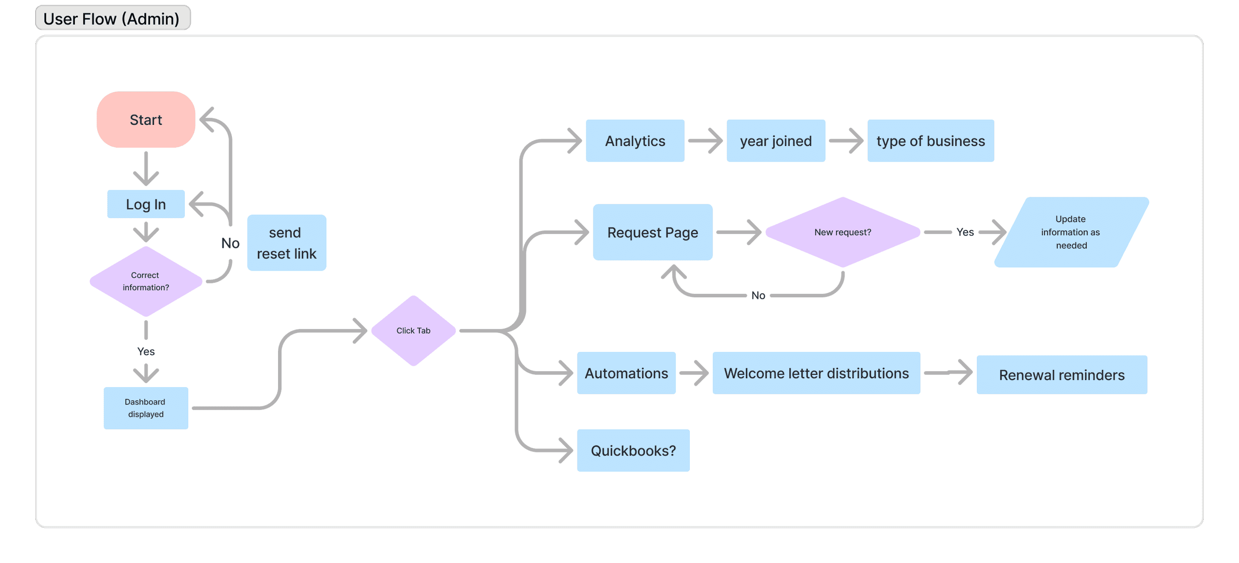
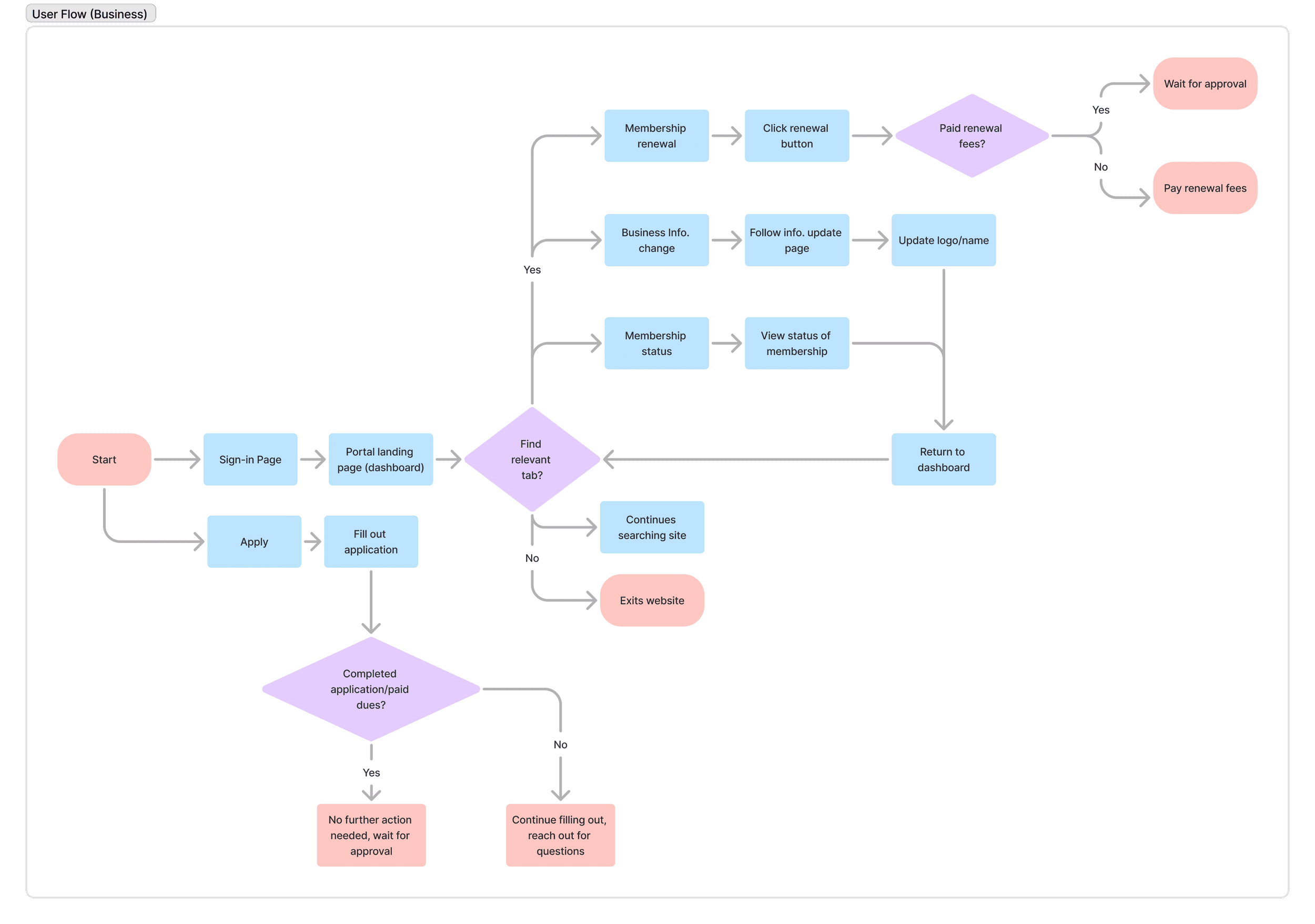
In order to have a more visualized dashboard experience, our team developed two different workflow diagrams that reflected each user perspective. These diagrams mapped process steps, touchpoints, and information flow across screens, helping us determine the number of screens, their capabilities, and system interactions. This not only helped us simplify our design process, but also made sure that we take into consideration both the needs of both sides before proceeding to high-fidelity mockups.
My Area of Focus
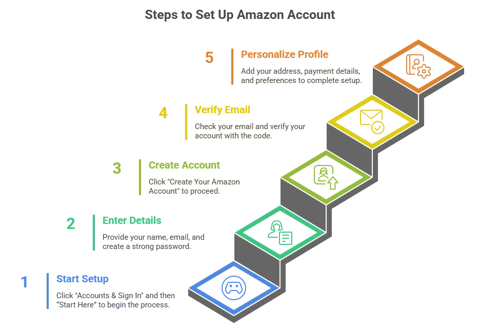
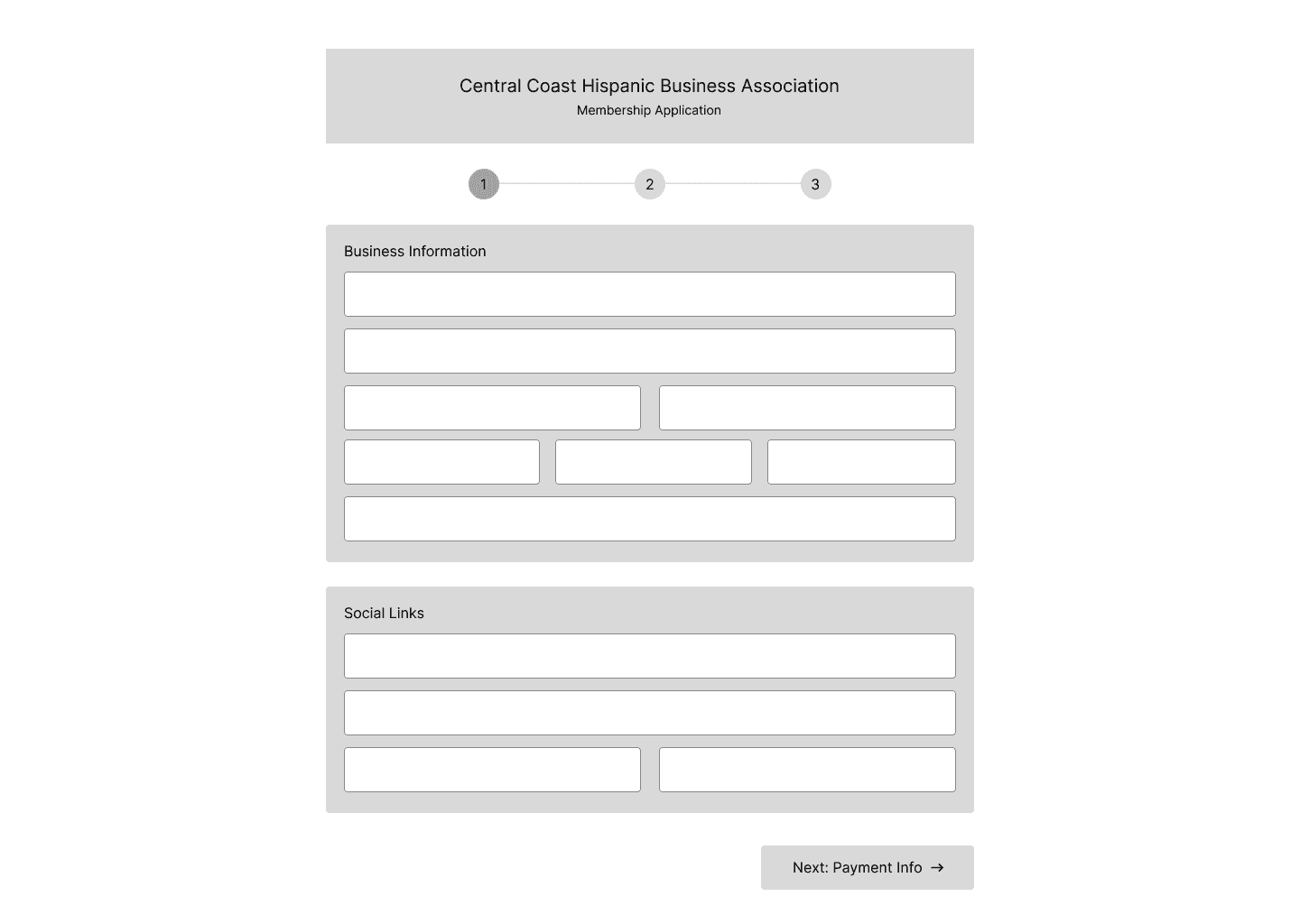
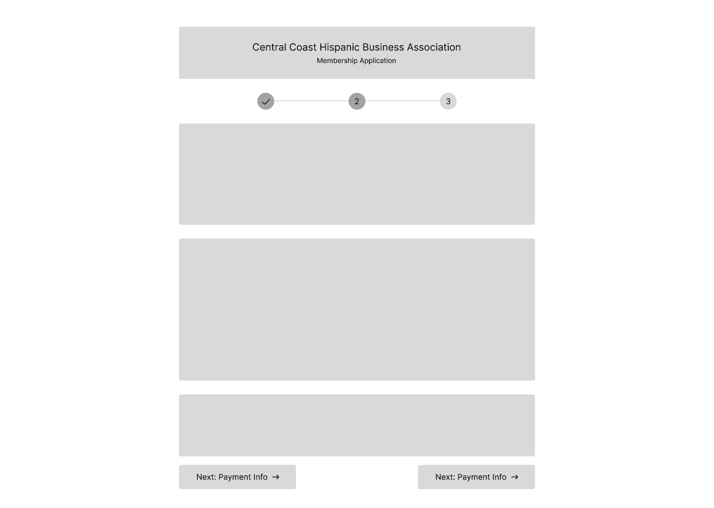
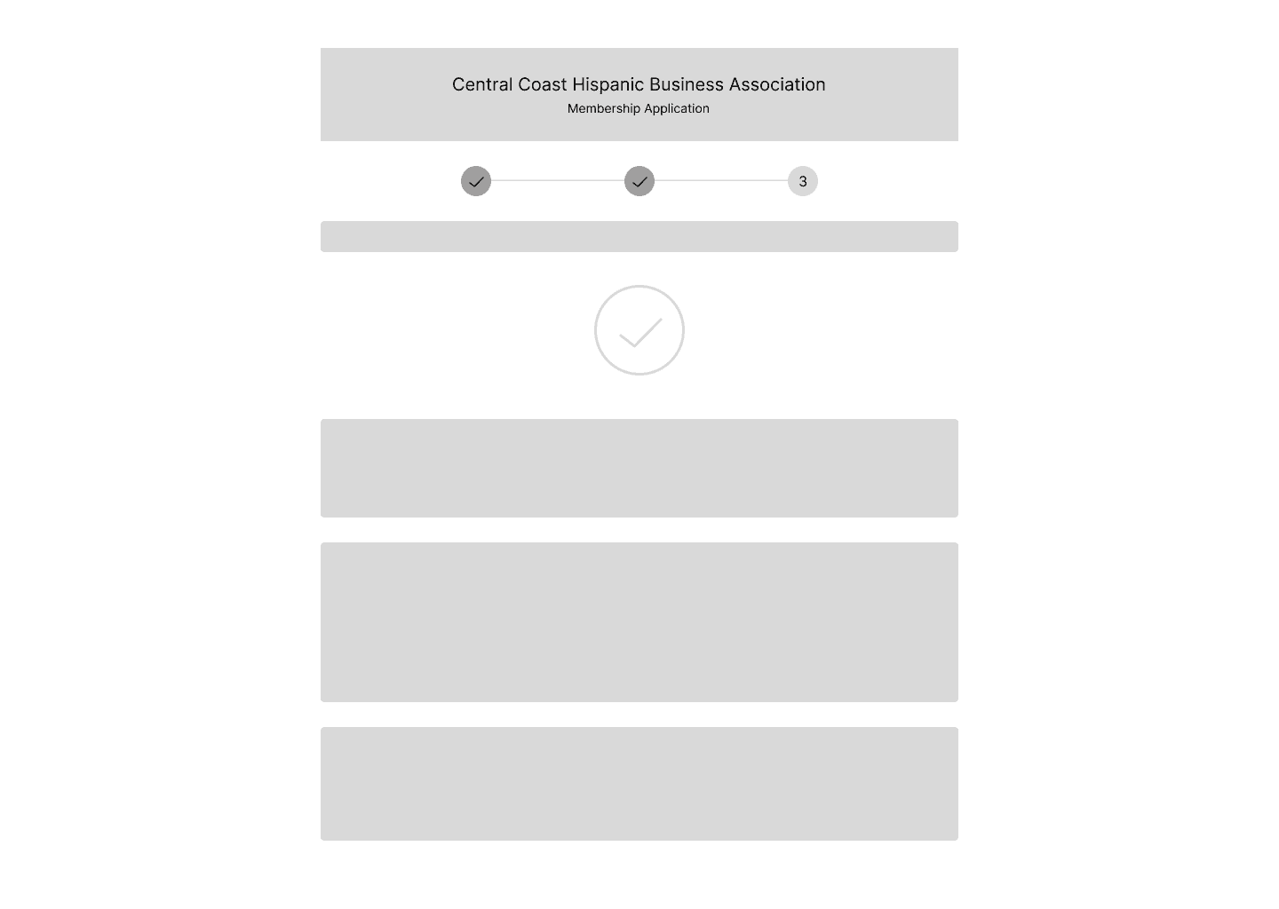
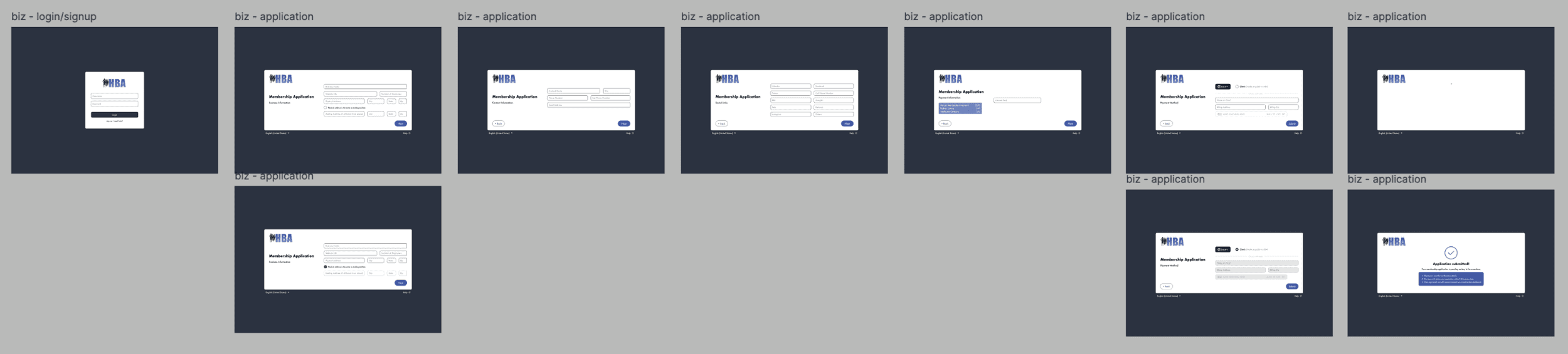
For my portion of the project, I was assigned the task of translating a simple membership sign-up sheet into a seamless, fully working online digital form. I was inspired by Facebook, Instagram, Google, and Amazon’s sign-up interface and I created each part of the HBA membership sign up document as an independent step-by-step screen process.

View HBA's Membership Form
For example, the first “step” or landing screen asks the user to input some basic personal data followed by a screen that asks for the business’ mailing address. The next screen will then ask for social media links as that will be showcased on their individual business page for the admin to view.
My goal in mind was to create a very easy and friendly process to follow, with short prompts to answer that will help the user to complete this sign-up process without feeling overwhelmed. This input model is widely known to many users (as shown in big companies such as Amazon, Youtube, etc.) so, this would help increase completion rates and ease the submission process.
There was debate on this multi-step interface as to whether this may be tiresome or repetitive to users, but after conducting a group interview of 50 individuals with a varied range of age, the data showed the multi-step approach to be favored and more streamlined. It was easier to handle versus having a long screen of questions which would force them to read and enter everything at once instead of having the information broken down into more manageable sections or categories.
The next section showcases my early design iterations through to the final solution, including the contributions from the rest of the team.
Source: Amazon Listing Services, 2025
Design System
Maria provided us with HBA’s already existing brand assets, their logo, and their colors. They already had a collection of colors that they identified with, and they would use throughout their communications and website. With the help of these brand elements, we could make sure that our designs did not contradict the visual identity of HBA and that they were recognizable to its members.
Mid-Fi
Once we showed our low-fidelity wireframes to the team, we immediately started working on incorporating the design system into our designs. Meanwhile, we looked to outside websites to provide additional inspiration, and it enabled us to narrow down our layout and interactive patterns. Based on this we could easily tweak our designs to align with the brand identity of HBA, but also to reflect on best practices within modern user interface design.
Design


Early Iterations
Admin View Lo-fi Wireframes
Business View Lo-fi Wireframes

Development Team
Once the dashboard designs were finalized, our team handed them to the development team to begin building the live system. Their team was made up of around 8 developers where they held bi-weekly meetings and changed to weekly meet-ups as the deadline grew closer.
A modern tech stack was utilized: Clerk (authentication), MongoDB (database), AWS S3 (file storage), JavaScript HTML CSS (frontend), and Wix to create the integration. They also added GitHub as a version control, Square to make payments and QuickBooks to keep accounts.
Extra Notes:
Key business-side functionality was editable fields (ex. business name, contact details, address), the ability to have only one active request to a business, and membership sign-up flow which need admin’s approval before they could be granted access to their dashboard. Upon approval, the businesses are given a welcome letter and then they will be prompted to pay, with the next payment scheduled one year later, regardless of when they paid.
On the admin side, they created membership management tools, messaging tools (with a subject line and a dropdown menu to choose the type of business), and activity tracking (restricted to the last 30 days). Mailing addresses and payment dates could also be changed manually by the admin.
To accommodate for Spanish-speaking members, the team included an additional feature with complete translation into the Spanish language and a switch button, which takes the whole site (including the navigation) to either English or Spanish. This will aid in the accessibility for new and current businesses.
Final Prototype
Unfortunatly, I do not have access to the live website as it is currently being used by the association, but here are Figma clips.
Interactive prototypes created in Figma by my teammate and me, showcasing how users would navigate the dashboard on the business’ side.
We designed an all-in-one membership dashboard that simplified HBA’s overall process, both in terms of applications and renewals as well as invoicing, payments and reporting. With the production of a digital platform, we have removed the data entry and lack of connection between workflows, which provided the organization with a single system to handle members efficiently. The dashboard is consistent with the current brand identity of HBA and offered a clear framework of multiple user interfaces, enabling the administrators and the members to interface with the system without challenges.
This not only helped Maria in lightening the administrative load, but also provided the association with more time and resources to devote on community involvement and the expansion of the business.

“Wow this is really good stuff guys. This is going to help me a lot and my assitant can handle the admin side when I’m on vacation!”
Maria, HBA President
Solution
Takeaways
Strong Communication with Developers

Clear communication helps developers understand design rationale and accurately translate designs into the final product.
Usability Testing
Initial usability testing supported our design decisions, but continued testing would help ensure a reliable, user-friendly final product.
Reflection


Hispanic Business Association
Role
UX Researcher
UX Designer
Team
4 Designers
8 Developers
Timeline
Fall 2025
Winter 2025
Tools
FigJam
Figma
Overview
What is the Hispanic Business Accociation?
The Hispanic Business Association (HBA) is a non-profit organization whose mission is to support the growth and success of Hispanic-owned businesses on California’s Central Coast. They are built on a foundation of networking, community participation, and cultural awareness, which connects the Spanish-speaking clients with the businesses that align with their values.
Through monthly meetings and local engagement, the organization helps to provide resources, mentorship opportunities, and a platform for business collaboration. Today, HBA has around 30 members who play a significant role in the development of business within the Hispanic community.
For this project, our point of contact was Maria Garcia, the President of HBA, who provided insight into her challenges and goals.
The Problem
This process was tedious, inefficient, and unsustainable as the organization continued to expand, preventing Maria from focusing on more impactful community work.
📝
Manual Membership Intake
Hand-submitted applications caused delays, errors, and added admin workload.
📊
Disconnected Data & Workflows
Managing member data, invoices, and communications across ledgers and QuickBooks created repetitive admin work.
📈
Lack of Membership Insight/Growth
Handling renewals, engagement, and reports manually increased admin burden and made growth hard to track.
Deliverables
Our deliverable was to design a dashboard portal that would address all of Maria’s needs and concerns. Since this would be a newly implemented system, we conducted research on existing portal layouts and how they would efficiently be designed.
Our team divided the tasks: two designers worked on the admin view, while the other two handled the business view.
Admin View
The admin dashboard includes:
a simple login screen
a section for managing business requests
visual data reports of businesses
automated email distribution of welcome letters and notices
Business View
The bus. dashboard includes:
editing business information like the business owner, point of contact, address, and contact details
a membership sign-up interface which allows new business to request to join the association
Research
In order to have a more visualized dashboard experience, our team developed two different workflow diagrams that reflected each user perspective. These diagrams mapped process steps, touchpoints, and information flow across screens, helping us determine the number of screens, their capabilities, and system interactions. This not only helped us simplify our design process, but also made sure that we take into consideration both the needs of both sides before proceeding to high-fidelity mockups.
My Area of Focus
For my portion of the project, I was assigned the task of translating a simple membership sign-up sheet into a seamless, fully working online digital form. I was inspired by Facebook, Instagram, Google, and Amazon’s sign-up interface and I created each part of the HBA membership sign up document as an independent step-by-step screen process.
View HBA's Membership Form
For example, the first “step” or landing screen asks the user to input some basic personal data followed by a screen that asks for the business’ mailing address. The next screen will then ask for social media links as that will be showcased on their individual business page for the admin to view.
My goal in mind was to create a very easy and friendly process to follow, with short prompts to answer that will help the user to complete this sign-up process without feeling overwhelmed. This input model is widely known to many users (as shown in big companies such as Amazon, Youtube, etc.) so, this would help increase completion rates and ease the submission process.
There was debate on this multi-step interface as to whether this may be tiresome or repetitive to users, but after conducting a group interview of 50 individuals with a varied range of age, the data showed the multi-step approach to be favored and more streamlined. It was easier to handle versus having a long screen of questions which would force them to read and enter everything at once instead of having the information broken down into more manageable sections or categories.
The next section showcases my early design iterations through to the final solution, including the contributions from the rest of the team.
Source: Amazon Listing Services, 2025
Design System
Maria provided us with HBA’s already existing brand assets, their logo, and their colors. They already had a collection of colors that they identified with, and they would use throughout their communications and website. With the help of these brand elements, we could make sure that our designs did not contradict the visual identity of HBA and that they were recognizable to its members.
Mid-Fi
Once we showed our low-fidelity wireframes to the team, we immediately started working on incorporating the design system into our designs. Meanwhile, we looked to outside websites to provide additional inspiration, and it enabled us to narrow down our layout and interactive patterns. Based on this we could easily tweak our designs to align with the brand identity of HBA, but also to reflect on best practices within modern user interface design.
Design
Early Iterations
Admin View Lo-fi Wireframes
Business View Lo-fi Wireframes
Development Team
Once the dashboard designs were finalized, our team handed them to the development team to begin building the live system. Their team was made up of around 8 developers where they held bi-weekly meetings and changed to weekly meet-ups as the deadline grew closer.
A modern tech stack was utilized: Clerk (authentication), MongoDB (database), AWS S3 (file storage), JavaScript HTML CSS (frontend), and Wix to create the integration. They also added GitHub as a version control, Square to make payments and QuickBooks to keep accounts.
Extra Notes:
Key business-side functionality was editable fields (ex. business name, contact details, address), the ability to have only one active request to a business, and membership sign-up flow which need admin’s approval before they could be granted access to their dashboard. Upon approval, the businesses are given a welcome letter and then they will be prompted to pay, with the next payment scheduled one year later, regardless of when they paid.
On the admin side, they created membership management tools, messaging tools (with a subject line and a dropdown menu to choose the type of business), and activity tracking (restricted to the last 30 days). Mailing addresses and payment dates could also be changed manually by the admin.
To accommodate for Spanish-speaking members, the team included an additional feature with complete translation into the Spanish language and a switch button, which takes the whole site (including the navigation) to either English or Spanish. This will aid in the accessibility for new and current businesses.
Final Prototype
Unfortunatly, I do not have access to the live website as it is currently being used by the association, but here are Figma clips.
Interactive prototypes created in Figma by my teammate and me, showcasing how users would navigate the dashboard on the business’ side.
We designed an all-in-one membership dashboard that simplified HBA’s overall process, both in terms of applications and renewals as well as invoicing, payments and reporting. With the production of a digital platform, we have removed the data entry and lack of connection between workflows, which provided the organization with a single system to handle members efficiently. The dashboard is consistent with the current brand identity of HBA and offered a clear framework of multiple user interfaces, enabling the administrators and the members to interface with the system without challenges.
This not only helped Maria in lightening the administrative load, but also provided the association with more time and resources to devote on community involvement and the expansion of the business.
“Wow this is really good stuff guys. This is going to help me a lot and my assitant can handle the admin side when I’m on vacation!”
Maria, HBA President
Solution
Takeaways
Strong Communication with Developers
Clear communication helps developers understand design rationale and accurately translate designs into the final product.
Usability Testing
Initial usability testing supported our design decisions, but continued testing would help ensure a reliable, user-friendly final product.
Reflection
Hispanic Business Assocation
Role
UX Researcher
UX Designer
Team
4 Designers
8 Developers
Timeline
Fall 2025
Winter 2025
Tools
FigJam
Figma

The Problem
This process was tedious, inefficient, and unsustainable as the organization continued to expand, preventing Maria from focusing on more impactful community work.
Overview
What is the Hispanic Business Association?
The Hispanic Business Association (HBA) is a non-profit organization whose mission is to support the growth and success of Hispanic-owned businesses on California’s Central Coast. They are built on a foundation of networking, community participation, and cultural awareness, which connects the Spanish-speaking clients with the businesses that align with their values.
Through monthly meetings and local engagement, the organization helps to provide resources, mentorship opportunities, and a platform for business collaboration. Today, HBA has around 30 members who play a significant role in the development of business within the Hispanic community.
For this project, our point of contact was Maria Garcia, the President of HBA, who provided insight into her challenges and goals.
📝
Manual Membership Intake
Hand-submitted applications caused delays, errors, and added admin workload.
📊
Disconnected Data & Workflows
Managing member data, invoices, and communications across ledgers and QuickBooks created repetitive admin work.
📈
Lack of Membership Insight/Growth
Handling renewals, engagement, and reports manually increased admin burden and made growth hard to track.
Deliverables
Our deliverable was to design a dashboard portal that would address all of Maria’s needs and concerns. Since this would be a newly implemented system, we conducted research on existing portal layouts and how they would efficiently be designed.
Our team divided the tasks: two designers worked on the admin view, while the other two handled the business view.
Admin View
The admin dashboard includes:
a simple login screen
a section for managing business requests
visual data reports of businesses
automated email distribution of welcome letters and notices
Business View
The bus. dashboard includes:
editing business information like the business owner, point of contact, address, and contact details
a membership sign-up interface which allows new business to request to join the association
Design
Design System
Maria provided us with HBA’s already existing brand assets, their logo, and their colors. They already had a collection of colors that they identified with, and they would use throughout their communications and website. With the help of these brand elements, we could make sure that our designs did not contradict the visual identity of HBA and that they were recognizable to its members.
Mid-Fi
Once we showed our low-fidelity wireframes to the team, we immediately started working on incorporating the design system into our designs. Meanwhile, we looked to outside websites to provide additional inspiration, and it enabled us to narrow down our layout and interactive patterns. Based on this we could easily tweak our designs to align with the brand identity of HBA, but also to reflect on best practices within modern user interface design.
Business View Lo-fi Wireframes
Early Iterations
Admin View Lo-fi Wireframes
Research
In order to have a more visualized dashboard experience, our team developed two different workflow diagrams that reflected each user perspective. These diagrams mapped process steps, touchpoints, and information flow across screens, helping us determine the number of screens, their capabilities, and system interactions. This not only helped us simplify our design process, but also made sure that we take into consideration both the needs of both sides before proceeding to high-fidelity mockups.
My Area of Focus
For my portion of the project, I was assigned the task of translating a simple membership sign-up sheet into a seamless, fully working online digital form. I was inspired by Facebook, Instagram, Google, and Amazon’s sign-up interface and I created each part of the HBA membership sign up document as an independent step-by-step screen process.
View HBA's Membership Form
For example, the first “step” or landing screen asks the user to input some basic personal data followed by a screen that asks for the business’ mailing address. The next screen will then ask for social media links as that will be showcased on their individual business page for the admin to view.
Source: Amazon Listing Services, 2025
My goal in mind was to create a very easy and friendly process to follow, with short prompts to answer that will help the user to complete this sign-up process without feeling overwhelmed. This input model is widely known to many users (as shown in big companies such as Amazon, Youtube, etc.) so, this would help increase completion rates and ease the submission process.
There was debate on this multi-step interface as to whether this may be tiresome or repetitive to users, but after conducting a group interview of 50 individuals with a varied range of age, the data showed the multi-step approach to be favored and more streamlined. It was easier to handle versus having a long screen of questions which would force them to read and enter everything at once instead of having the information broken down into more manageable sections or categories.
The next section showcases my early design iterations through to the final solution, including the contributions from the rest of the team.
Solution
We designed an all-in-one membership dashboard that simplified HBA’s overall process, both in terms of applications and renewals as well as invoicing, payments and reporting. With the production of a digital platform, we have removed the data entry and lack of connection between workflows, which provided the organization with a single system to handle members efficiently. The dashboard is consistent with the current brand identity of HBA and offered a clear framework of multiple user interfaces, enabling the administrators and the members to interface with the system without challenges.
This not only helped Maria in lightening the administrative load, but also provided the association with more time and resources to devote on community involvement and the expansion of the business.
Final Prototype
Unfortunatly, I do not have access to the live website as it is currently being used by the association, but here are Figma clips.
Interactive prototypes created in Figma by my teammate and me, showcasing how users would navigate the dashboard on the business’ side.
Development Team
Once the dashboard designs were finalized, our team handed them to the development team to begin building the live system. Their team was made up of around 8 developers where they held bi-weekly meetings and changed to weekly meet-ups as the deadline grew closer.
A modern tech stack was utilized: Clerk (authentication), MongoDB (database), AWS S3 (file storage), JavaScript HTML CSS (frontend), and Wix to create the integration. They also added GitHub as a version control, Square to make payments and QuickBooks to keep accounts.
Extra Notes:
Key business-side functionality was editable fields (ex. business name, contact details, address), the ability to have only one active request to a business, and membership sign-up flow which need admin’s approval before they could be granted access to their dashboard. Upon approval, the businesses are given a welcome letter and then they will be prompted to pay, with the next payment scheduled one year later, regardless of when they paid.
On the admin side, they created membership management tools, messaging tools (with a subject line and a dropdown menu to choose the type of business), and activity tracking (restricted to the last 30 days). Mailing addresses and payment dates could also be changed manually by the admin.
To accommodate for Spanish-speaking members, the team included an additional feature with complete translation into the Spanish language and a switch button, which takes the whole site (including the navigation) to either English or Spanish. This will aid in the accessibility for new and current businesses.
“Wow this is really good stuff guys. This is going to help me a lot and my assitant can handle the admin side when I’m on vacation!”
Maria, HBA President
Reflection
Takeaways
Strong Communication with developers
Clear communication helps developers understand design rationale and accurately translate designs into the final product.
Usability Testing
Initial usability testing supported our design decisions, but continued testing would help ensure a reliable, user-friendly final product.


Hispanic Business Association
Role
UX Researcher
UX Designer
Team
4 Designers
8 Developers
Timeline
Fall 2025
Winter 2025
Tools
FigJam
Figma
Overview
What is the Hispanic Business Accociation?
The Hispanic Business Association (HBA) is a non-profit organization whose mission is to support the growth and success of Hispanic-owned businesses on California’s Central Coast. They are built on a foundation of networking, community participation, and cultural awareness, which connects the Spanish-speaking clients with the businesses that align with their values.
Through monthly meetings and local engagement, the organization helps to provide resources, mentorship opportunities, and a platform for business collaboration. Today, HBA has around 30 members who play a significant role in the development of business within the Hispanic community.
For this project, our point of contact was Maria Garcia, the President of HBA, who provided insight into her challenges and goals.
The Problem
This process was tedious, inefficient, and unsustainable as the organization continued to expand, preventing Maria from focusing on more impactful community work.
📝
Manual Membership Intake
Hand-submitted applications caused delays, errors, and added admin workload.
📊
Disconnected Data & Workflows
Managing member data, invoices, and communications across ledgers and QuickBooks created repetitive admin work.
📈
Lack of Membership Insight/Growth
Handling renewals, engagement, and reports manually increased admin burden and made growth hard to track.
Deliverables
Our deliverable was to design a dashboard portal that would address all of Maria’s needs and concerns. Since this would be a newly implemented system, we conducted research on existing portal layouts and how they would efficiently be designed.
Our team divided the tasks: two designers worked on the admin view, while the other two handled the business view.
Admin View
The admin dashboard includes:
a simple login screen
a section for managing business requests
visual data reports of businesses
automated email distribution of welcome letters and notices
Business View
The bus. dashboard includes:
editing business information like the business owner, point of contact, address, and contact details
a membership sign-up interface which allows new business to request to join the association
Research
In order to have a more visualized dashboard experience, our team developed two different workflow diagrams that reflected each user perspective. These diagrams mapped process steps, touchpoints, and information flow across screens, helping us determine the number of screens, their capabilities, and system interactions. This not only helped us simplify our design process, but also made sure that we take into consideration both the needs of both sides before proceeding to high-fidelity mockups.
My Area of Focus
For my portion of the project, I was assigned the task of translating a simple membership sign-up sheet into a seamless, fully working online digital form. I was inspired by Facebook, Instagram, Google, and Amazon’s sign-up interface and I created each part of the HBA membership sign up document as an independent step-by-step screen process.
View HBA's Membership Form
For example, the first “step” or landing screen asks the user to input some basic personal data followed by a screen that asks for the business’ mailing address. The next screen will then ask for social media links as that will be showcased on their individual business page for the admin to view.
My goal in mind was to create a very easy and friendly process to follow, with short prompts to answer that will help the user to complete this sign-up process without feeling overwhelmed. This input model is widely known to many users (as shown in big companies such as Amazon, Youtube, etc.) so, this would help increase completion rates and ease the submission process.
There was debate on this multi-step interface as to whether this may be tiresome or repetitive to users, but after conducting a group interview of 50 individuals with a varied range of age, the data showed the multi-step approach to be favored and more streamlined. It was easier to handle versus having a long screen of questions which would force them to read and enter everything at once instead of having the information broken down into more manageable sections or categories.
The next section showcases my early design iterations through to the final solution, including the contributions from the rest of the team.
Source: Amazon Listing Services, 2025
Design System
Maria provided us with HBA’s already existing brand assets, their logo, and their colors. They already had a collection of colors that they identified with, and they would use throughout their communications and website. With the help of these brand elements, we could make sure that our designs did not contradict the visual identity of HBA and that they were recognizable to its members.
Mid-Fi
Once we showed our low-fidelity wireframes to the team, we immediately started working on incorporating the design system into our designs. Meanwhile, we looked to outside websites to provide additional inspiration, and it enabled us to narrow down our layout and interactive patterns. Based on this we could easily tweak our designs to align with the brand identity of HBA, but also to reflect on best practices within modern user interface design.
Design
Early Iterations
Admin View Lo-fi Wireframes
Business View Lo-fi Wireframes
Development Team
Once the dashboard designs were finalized, our team handed them to the development team to begin building the live system. Their team was made up of around 8 developers where they held bi-weekly meetings and changed to weekly meet-ups as the deadline grew closer.
A modern tech stack was utilized: Clerk (authentication), MongoDB (database), AWS S3 (file storage), JavaScript HTML CSS (frontend), and Wix to create the integration. They also added GitHub as a version control, Square to make payments and QuickBooks to keep accounts.
Extra Notes:
Key business-side functionality was editable fields (ex. business name, contact details, address), the ability to have only one active request to a business, and membership sign-up flow which need admin’s approval before they could be granted access to their dashboard. Upon approval, the businesses are given a welcome letter and then they will be prompted to pay, with the next payment scheduled one year later, regardless of when they paid.
On the admin side, they created membership management tools, messaging tools (with a subject line and a dropdown menu to choose the type of business), and activity tracking (restricted to the last 30 days). Mailing addresses and payment dates could also be changed manually by the admin.
To accommodate for Spanish-speaking members, the team included an additional feature with complete translation into the Spanish language and a switch button, which takes the whole site (including the navigation) to either English or Spanish. This will aid in the accessibility for new and current businesses.
Final Prototype
Unfortunatly, I do not have access to the live website as it is currently being used by the association, but here are Figma clips.
Interactive prototypes created in Figma by my teammate and me, showcasing how users would navigate the dashboard on the business’ side.
We designed an all-in-one membership dashboard that simplified HBA’s overall process, both in terms of applications and renewals as well as invoicing, payments and reporting. With the production of a digital platform, we have removed the data entry and lack of connection between workflows, which provided the organization with a single system to handle members efficiently. The dashboard is consistent with the current brand identity of HBA and offered a clear framework of multiple user interfaces, enabling the administrators and the members to interface with the system without challenges.
This not only helped Maria in lightening the administrative load, but also provided the association with more time and resources to devote on community involvement and the expansion of the business.
“Wow this is really good stuff guys. This is going to help me a lot and my assitant can handle the admin side when I’m on vacation!”
Maria, HBA President
Solution
Takeaways
Strong Communication with Developers
Clear communication helps developers understand design rationale and accurately translate designs into the final product.
Usability Testing
Initial usability testing supported our design decisions, but continued testing would help ensure a reliable, user-friendly final product.
Reflection
Hispanic Business Assocation
Role
UX Researcher
UX Designer
Team
4 Designers
8 Developers
Timeline
Fall 2025
Winter 2025
Tools
FigJam
Figma
The Problem
This process was tedious, inefficient, and unsustainable as the organization continued to expand, preventing Maria from focusing on more impactful community work.
Overview
What is the Hispanic Business Association?
The Hispanic Business Association (HBA) is a non-profit organization whose mission is to support the growth and success of Hispanic-owned businesses on California’s Central Coast. They are built on a foundation of networking, community participation, and cultural awareness, which connects the Spanish-speaking clients with the businesses that align with their values.
Through monthly meetings and local engagement, the organization helps to provide resources, mentorship opportunities, and a platform for business collaboration. Today, HBA has around 30 members who play a significant role in the development of business within the Hispanic community.
For this project, our point of contact was Maria Garcia, the President of HBA, who provided insight into her challenges and goals.
📝
Manual Membership Intake
Hand-submitted applications caused delays, errors, and added admin workload.
📊
Disconnected Data & Workflows
Managing member data, invoices, and communications across ledgers and QuickBooks created repetitive admin work.
📈
Lack of Membership Insight/Growth
Handling renewals, engagement, and reports manually increased admin burden and made growth hard to track.
Deliverables
Our deliverable was to design a dashboard portal that would address all of Maria’s needs and concerns. Since this would be a newly implemented system, we conducted research on existing portal layouts and how they would efficiently be designed.
Our team divided the tasks: two designers worked on the admin view, while the other two handled the business view.
Admin View
The admin dashboard includes:
a simple login screen
a section for managing business requests
visual data reports of businesses
automated email distribution of welcome letters and notices
Business View
The bus. dashboard includes:
editing business information like the business owner, point of contact, address, and contact details
a membership sign-up interface which allows new business to request to join the association
Design
Design System
Maria provided us with HBA’s already existing brand assets, their logo, and their colors. They already had a collection of colors that they identified with, and they would use throughout their communications and website. With the help of these brand elements, we could make sure that our designs did not contradict the visual identity of HBA and that they were recognizable to its members.
Mid-Fi
Once we showed our low-fidelity wireframes to the team, we immediately started working on incorporating the design system into our designs. Meanwhile, we looked to outside websites to provide additional inspiration, and it enabled us to narrow down our layout and interactive patterns. Based on this we could easily tweak our designs to align with the brand identity of HBA, but also to reflect on best practices within modern user interface design.
Business View Lo-fi Wireframes
Early Iterations
Admin View Lo-fi Wireframes
Research
In order to have a more visualized dashboard experience, our team developed two different workflow diagrams that reflected each user perspective. These diagrams mapped process steps, touchpoints, and information flow across screens, helping us determine the number of screens, their capabilities, and system interactions. This not only helped us simplify our design process, but also made sure that we take into consideration both the needs of both sides before proceeding to high-fidelity mockups.
My Area of Focus
For my portion of the project, I was assigned the task of translating a simple membership sign-up sheet into a seamless, fully working online digital form. I was inspired by Facebook, Instagram, Google, and Amazon’s sign-up interface and I created each part of the HBA membership sign up document as an independent step-by-step screen process.
View HBA's Membership Form
For example, the first “step” or landing screen asks the user to input some basic personal data followed by a screen that asks for the business’ mailing address. The next screen will then ask for social media links as that will be showcased on their individual business page for the admin to view.
Source: Amazon Listing Services, 2025
My goal in mind was to create a very easy and friendly process to follow, with short prompts to answer that will help the user to complete this sign-up process without feeling overwhelmed. This input model is widely known to many users (as shown in big companies such as Amazon, Youtube, etc.) so, this would help increase completion rates and ease the submission process.
There was debate on this multi-step interface as to whether this may be tiresome or repetitive to users, but after conducting a group interview of 50 individuals with a varied range of age, the data showed the multi-step approach to be favored and more streamlined. It was easier to handle versus having a long screen of questions which would force them to read and enter everything at once instead of having the information broken down into more manageable sections or categories.
The next section showcases my early design iterations through to the final solution, including the contributions from the rest of the team.
Solution
We designed an all-in-one membership dashboard that simplified HBA’s overall process, both in terms of applications and renewals as well as invoicing, payments and reporting. With the production of a digital platform, we have removed the data entry and lack of connection between workflows, which provided the organization with a single system to handle members efficiently. The dashboard is consistent with the current brand identity of HBA and offered a clear framework of multiple user interfaces, enabling the administrators and the members to interface with the system without challenges.
This not only helped Maria in lightening the administrative load, but also provided the association with more time and resources to devote on community involvement and the expansion of the business.
Final Prototype
Unfortunatly, I do not have access to the live website as it is currently being used by the association, but here are Figma clips.
Interactive prototypes created in Figma by my teammate and me, showcasing how users would navigate the dashboard on the business’ side.
Development Team
Once the dashboard designs were finalized, our team handed them to the development team to begin building the live system. Their team was made up of around 8 developers where they held bi-weekly meetings and changed to weekly meet-ups as the deadline grew closer.
A modern tech stack was utilized: Clerk (authentication), MongoDB (database), AWS S3 (file storage), JavaScript HTML CSS (frontend), and Wix to create the integration. They also added GitHub as a version control, Square to make payments and QuickBooks to keep accounts.
Extra Notes:
Key business-side functionality was editable fields (ex. business name, contact details, address), the ability to have only one active request to a business, and membership sign-up flow which need admin’s approval before they could be granted access to their dashboard. Upon approval, the businesses are given a welcome letter and then they will be prompted to pay, with the next payment scheduled one year later, regardless of when they paid.
On the admin side, they created membership management tools, messaging tools (with a subject line and a dropdown menu to choose the type of business), and activity tracking (restricted to the last 30 days). Mailing addresses and payment dates could also be changed manually by the admin.
To accommodate for Spanish-speaking members, the team included an additional feature with complete translation into the Spanish language and a switch button, which takes the whole site (including the navigation) to either English or Spanish. This will aid in the accessibility for new and current businesses.
“Wow this is really good stuff guys. This is going to help me a lot and my assitant can handle the admin side when I’m on vacation!”
Maria, HBA President
Reflection
Takeaways
Strong Communication with developers
Clear communication helps developers understand design rationale and accurately translate designs into the final product.
Usability Testing
Initial usability testing supported our design decisions, but continued testing would help ensure a reliable, user-friendly final product.
Hispanic Business Association
Role
UX Researcher
UX Designer
Team
4 Designers
8 Developers
Timeline
Fall 2025
Winter 2025
Tools
FigJam
Figma
Overview
What is the Hispanic Business Accociation?
The Hispanic Business Association (HBA) is a non-profit organization whose mission is to support the growth and success of Hispanic-owned businesses on California’s Central Coast. They are built on a foundation of networking, community participation, and cultural awareness, which connects the Spanish-speaking clients with the businesses that align with their values.
Through monthly meetings and local engagement, the organization helps to provide resources, mentorship opportunities, and a platform for business collaboration. Today, HBA has around 30 members who play a significant role in the development of business within the Hispanic community.
For this project, our point of contact was Maria Garcia, the President of HBA, who provided insight into her challenges and goals.
The Problem
This process was tedious, inefficient, and unsustainable as the organization continued to expand, preventing Maria from focusing on more impactful community work.
📝
Manual Membership Intake
Hand-submitted applications caused delays, errors, and added admin workload.
📊
Disconnected Data & Workflows
Managing member data, invoices, and communications across ledgers and QuickBooks created repetitive admin work.
📈
Lack of Membership Insight/Growth
Handling renewals, engagement, and reports manually increased admin burden and made growth hard to track.
Deliverables
Our deliverable was to design a dashboard portal that would address all of Maria’s needs and concerns. Since this would be a newly implemented system, we conducted research on existing portal layouts and how they would efficiently be designed.
Our team divided the tasks: two designers worked on the admin view, while the other two handled the business view.
Admin View
The admin dashboard includes:
a simple login screen
a section for managing business requests
visual data reports of businesses
automated email distribution of welcome letters and notices
Business View
The bus. dashboard includes:
editing business information like the business owner, point of contact, address, and contact details
a membership sign-up interface which allows new business to request to join the association
Research
In order to have a more visualized dashboard experience, our team developed two different workflow diagrams that reflected each user perspective. These diagrams mapped process steps, touchpoints, and information flow across screens, helping us determine the number of screens, their capabilities, and system interactions. This not only helped us simplify our design process, but also made sure that we take into consideration both the needs of both sides before proceeding to high-fidelity mockups.
My Area of Focus
For my portion of the project, I was assigned the task of translating a simple membership sign-up sheet into a seamless, fully working online digital form. I was inspired by Facebook, Instagram, Google, and Amazon’s sign-up interface and I created each part of the HBA membership sign up document as an independent step-by-step screen process.
View HBA's Membership Form
For example, the first “step” or landing screen asks the user to input some basic personal data followed by a screen that asks for the business’ mailing address. The next screen will then ask for social media links as that will be showcased on their individual business page for the admin to view.
My goal in mind was to create a very easy and friendly process to follow, with short prompts to answer that will help the user to complete this sign-up process without feeling overwhelmed. This input model is widely known to many users (as shown in big companies such as Amazon, Youtube, etc.) so, this would help increase completion rates and ease the submission process.
There was debate on this multi-step interface as to whether this may be tiresome or repetitive to users, but after conducting a group interview of 50 individuals with a varied range of age, the data showed the multi-step approach to be favored and more streamlined. It was easier to handle versus having a long screen of questions which would force them to read and enter everything at once instead of having the information broken down into more manageable sections or categories.
The next section showcases my early design iterations through to the final solution, including the contributions from the rest of the team.
Source: Amazon Listing Services, 2025
Design System
Maria provided us with HBA’s already existing brand assets, their logo, and their colors. They already had a collection of colors that they identified with, and they would use throughout their communications and website. With the help of these brand elements, we could make sure that our designs did not contradict the visual identity of HBA and that they were recognizable to its members.
Mid-Fi
Once we showed our low-fidelity wireframes to the team, we immediately started working on incorporating the design system into our designs. Meanwhile, we looked to outside websites to provide additional inspiration, and it enabled us to narrow down our layout and interactive patterns. Based on this we could easily tweak our designs to align with the brand identity of HBA, but also to reflect on best practices within modern user interface design.
Design
Early Iterations
Admin View Lo-fi Wireframes
Business View Lo-fi Wireframes
Development Team
Once the dashboard designs were finalized, our team handed them to the development team to begin building the live system. Their team was made up of around 8 developers where they held bi-weekly meetings and changed to weekly meet-ups as the deadline grew closer.
A modern tech stack was utilized: Clerk (authentication), MongoDB (database), AWS S3 (file storage), JavaScript HTML CSS (frontend), and Wix to create the integration. They also added GitHub as a version control, Square to make payments and QuickBooks to keep accounts.
Extra Notes:
Key business-side functionality was editable fields (ex. business name, contact details, address), the ability to have only one active request to a business, and membership sign-up flow which need admin’s approval before they could be granted access to their dashboard. Upon approval, the businesses are given a welcome letter and then they will be prompted to pay, with the next payment scheduled one year later, regardless of when they paid.
On the admin side, they created membership management tools, messaging tools (with a subject line and a dropdown menu to choose the type of business), and activity tracking (restricted to the last 30 days). Mailing addresses and payment dates could also be changed manually by the admin.
To accommodate for Spanish-speaking members, the team included an additional feature with complete translation into the Spanish language and a switch button, which takes the whole site (including the navigation) to either English or Spanish. This will aid in the accessibility for new and current businesses.
Final Prototype
Unfortunatly, I do not have access to the live website as it is currently being used by the association, but here are Figma clips.
Interactive prototypes created in Figma by my teammate and me, showcasing how users would navigate the dashboard on the business’ side.
We designed an all-in-one membership dashboard that simplified HBA’s overall process, both in terms of applications and renewals as well as invoicing, payments and reporting. With the production of a digital platform, we have removed the data entry and lack of connection between workflows, which provided the organization with a single system to handle members efficiently. The dashboard is consistent with the current brand identity of HBA and offered a clear framework of multiple user interfaces, enabling the administrators and the members to interface with the system without challenges.
This not only helped Maria in lightening the administrative load, but also provided the association with more time and resources to devote on community involvement and the expansion of the business.
“Wow this is really good stuff guys. This is going to help me a lot and my assitant can handle the admin side when I’m on vacation!”
Maria, HBA President
Solution
Takeaways
Strong Communication with Developers
Clear communication helps developers understand design rationale and accurately translate designs into the final product.
Usability Testing
Initial usability testing supported our design decisions, but continued testing would help ensure a reliable, user-friendly final product.
Reflection
Hispanic Business Assocation
Role
UX Researcher
UX Designer
Team
4 Designers
8 Developers
Timeline
Fall 2025
Winter 2025
Tools
FigJam
Figma
The Problem
This process was tedious, inefficient, and unsustainable as the organization continued to expand, preventing Maria from focusing on more impactful community work.
Overview
What is the Hispanic Business Association?
The Hispanic Business Association (HBA) is a non-profit organization whose mission is to support the growth and success of Hispanic-owned businesses on California’s Central Coast. They are built on a foundation of networking, community participation, and cultural awareness, which connects the Spanish-speaking clients with the businesses that align with their values.
Through monthly meetings and local engagement, the organization helps to provide resources, mentorship opportunities, and a platform for business collaboration. Today, HBA has around 30 members who play a significant role in the development of business within the Hispanic community.
For this project, our point of contact was Maria Garcia, the President of HBA, who provided insight into her challenges and goals.
📝
Manual Membership Intake
Hand-submitted applications caused delays, errors, and added admin workload.
📊
Disconnected Data & Workflows
Managing member data, invoices, and communications across ledgers and QuickBooks created repetitive admin work.
📈
Lack of Membership Insight/Growth
Handling renewals, engagement, and reports manually increased admin burden and made growth hard to track.
Deliverables
Our deliverable was to design a dashboard portal that would address all of Maria’s needs and concerns. Since this would be a newly implemented system, we conducted research on existing portal layouts and how they would efficiently be designed.
Our team divided the tasks: two designers worked on the admin view, while the other two handled the business view.
Admin View
The admin dashboard includes:
a simple login screen
a section for managing business requests
visual data reports of businesses
automated email distribution of welcome letters and notices
Business View
The bus. dashboard includes:
editing business information like the business owner, point of contact, address, and contact details
a membership sign-up interface which allows new business to request to join the association
Design
Design System
Maria provided us with HBA’s already existing brand assets, their logo, and their colors. They already had a collection of colors that they identified with, and they would use throughout their communications and website. With the help of these brand elements, we could make sure that our designs did not contradict the visual identity of HBA and that they were recognizable to its members.
Mid-Fi
Once we showed our low-fidelity wireframes to the team, we immediately started working on incorporating the design system into our designs. Meanwhile, we looked to outside websites to provide additional inspiration, and it enabled us to narrow down our layout and interactive patterns. Based on this we could easily tweak our designs to align with the brand identity of HBA, but also to reflect on best practices within modern user interface design.
Business View Lo-fi Wireframes
Early Iterations
Admin View Lo-fi Wireframes
Research
In order to have a more visualized dashboard experience, our team developed two different workflow diagrams that reflected each user perspective. These diagrams mapped process steps, touchpoints, and information flow across screens, helping us determine the number of screens, their capabilities, and system interactions. This not only helped us simplify our design process, but also made sure that we take into consideration both the needs of both sides before proceeding to high-fidelity mockups.
My Area of Focus
For my portion of the project, I was assigned the task of translating a simple membership sign-up sheet into a seamless, fully working online digital form. I was inspired by Facebook, Instagram, Google, and Amazon’s sign-up interface and I created each part of the HBA membership sign up document as an independent step-by-step screen process.
View HBA's Membership Form
For example, the first “step” or landing screen asks the user to input some basic personal data followed by a screen that asks for the business’ mailing address. The next screen will then ask for social media links as that will be showcased on their individual business page for the admin to view.
Source: Amazon Listing Services, 2025
My goal in mind was to create a very easy and friendly process to follow, with short prompts to answer that will help the user to complete this sign-up process without feeling overwhelmed. This input model is widely known to many users (as shown in big companies such as Amazon, Youtube, etc.) so, this would help increase completion rates and ease the submission process.
There was debate on this multi-step interface as to whether this may be tiresome or repetitive to users, but after conducting a group interview of 50 individuals with a varied range of age, the data showed the multi-step approach to be favored and more streamlined. It was easier to handle versus having a long screen of questions which would force them to read and enter everything at once instead of having the information broken down into more manageable sections or categories.
The next section showcases my early design iterations through to the final solution, including the contributions from the rest of the team.
Solution
We designed an all-in-one membership dashboard that simplified HBA’s overall process, both in terms of applications and renewals as well as invoicing, payments and reporting. With the production of a digital platform, we have removed the data entry and lack of connection between workflows, which provided the organization with a single system to handle members efficiently. The dashboard is consistent with the current brand identity of HBA and offered a clear framework of multiple user interfaces, enabling the administrators and the members to interface with the system without challenges.
This not only helped Maria in lightening the administrative load, but also provided the association with more time and resources to devote on community involvement and the expansion of the business.
Final Prototype
Unfortunatly, I do not have access to the live website as it is currently being used by the association, but here are Figma clips.
Interactive prototypes created in Figma by my teammate and me, showcasing how users would navigate the dashboard on the business’ side.
Development Team
Once the dashboard designs were finalized, our team handed them to the development team to begin building the live system. Their team was made up of around 8 developers where they held bi-weekly meetings and changed to weekly meet-ups as the deadline grew closer.
A modern tech stack was utilized: Clerk (authentication), MongoDB (database), AWS S3 (file storage), JavaScript HTML CSS (frontend), and Wix to create the integration. They also added GitHub as a version control, Square to make payments and QuickBooks to keep accounts.
Extra Notes:
Key business-side functionality was editable fields (ex. business name, contact details, address), the ability to have only one active request to a business, and membership sign-up flow which need admin’s approval before they could be granted access to their dashboard. Upon approval, the businesses are given a welcome letter and then they will be prompted to pay, with the next payment scheduled one year later, regardless of when they paid.
On the admin side, they created membership management tools, messaging tools (with a subject line and a dropdown menu to choose the type of business), and activity tracking (restricted to the last 30 days). Mailing addresses and payment dates could also be changed manually by the admin.
To accommodate for Spanish-speaking members, the team included an additional feature with complete translation into the Spanish language and a switch button, which takes the whole site (including the navigation) to either English or Spanish. This will aid in the accessibility for new and current businesses.
“Wow this is really good stuff guys. This is going to help me a lot and my assitant can handle the admin side when I’m on vacation!”
Maria, HBA President
Reflection
Takeaways
Strong Communication with developers
Clear communication helps developers understand design rationale and accurately translate designs into the final product.
Usability Testing
Initial usability testing supported our design decisions, but continued testing would help ensure a reliable, user-friendly final product.